One of the key ingredients of a good plot is providing enough information on the plot to help convey the message in the plot.
In this post we will examples of how to change x-axis and y-axis labels in a plot made with ggplot2 in R. And then we will see how to change axis labels that are multi-line. Then we will see an example of setting a title and subtitle to the plot.
Let us first load tidyverse package.
library(tidyverse)
We will use faithful data set in this example just like the earlier post on how to change axis font size in ggplot2.
head(faithful)

##   eruptions waiting
## 1     3.600      79
## 2     1.800      54
## 3     3.333      74
## 4     2.283      62
## 5     4.533      85
## 6     2.883      55
Let us first make a scatter plot like before with increased axis font before with increased axis font size.
faithful %>%
  ggplot(aes(x=eruptions,y=waiting)) +
  geom_point() +
  theme_bw(base_size=24)
If you are not familiar faithful dataset, x-axis and y-axis label would not make any sense. Old faithful dataset is about waiting time between eruptions and the duration of the eruption for the Old Faithful geyser located in Yellowstone National Park. The unit of time is in minutes.
How to Change Axis Labels with labs() in ggplot2?
Let us first change the axis labels to reflect that we have time on both the axes. We can change the axes labels using the ggplot2 function labs().
Within labs() function, we specify what the x and y axis labels are.
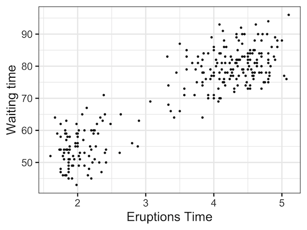
faithful %>%
  ggplot(aes(x=eruptions,y=waiting)) +
  geom_point() +
  theme_bw(base_size=24)+
  labs(x="Eruptions Time", y="Waiting time")
The scatter plot with new labels on both axes makes sense now, slightly.
How to Add Multi-line Axis Labels to plot with ggplot2?
We still don’t have the units on the axis labels. Often adding extra text can make the labels long. A solution is to make the labels multi-line.
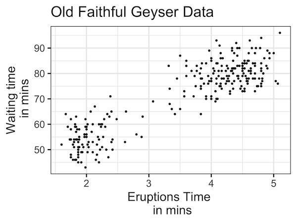
We can have multi-line labels using labs(), but this time having a newline when we want to break the label line. In our example, we add the units “in mins” as the second line for labels.
faithful %>%
  ggplot(aes(x=eruptions,y=waiting)) +
  geom_point() +
  theme_bw(base_size=24)+
  labs(x="Eruptions Time \n in mins", y="Waiting time\n in mins"
Now definitely the scatter plot makes more sense.

How to Add a Title to a plot with ggplot2?
We can add title to the plot to explain more about the plot. To add title, we can still use labs() function and provide the argument “title” with the title we want for the plot.
faithful %>%
  ggplot(aes(x=eruptions,y=waiting)) +
  geom_point() +
  theme_bw(base_size=24)+
  labs(x="Eruptions Time \n in mins", y="Waiting time\n in mins",
       title="Old Faithful Geyser Data")
How to Add a Subtitle to a plot with ggplot2?
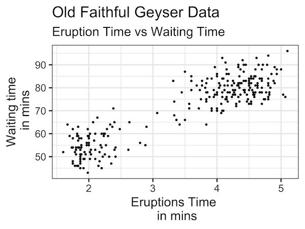
Similarly we can add subtitle to a ggplot2 plot using labs() function. We specify the sub-title we want with the subtitle argument inside labs() function.
faithful %>%
  ggplot(aes(x=eruptions,y=waiting)) +
  geom_point() +
  theme_bw(base_size=24)+
  labs(x="Eruptions Time \n in mins",
       y="Waiting time\n in mins",
       title="Old Faithful Geyser Data",
       subtitle="Eruption Time vs Waiting Time")
The subtitle text will be on new line right after the title in slightly smaller font. This helps differentiate the title and subtitle.
Explore the Complete ggplot2 Guide
35+ tutorials with code: scatterplots, boxplots, themes, annotations, facets, and more—tested and beginner-friendly.
Visit the ggplot2 Hub → No fluff—just code and visuals.