
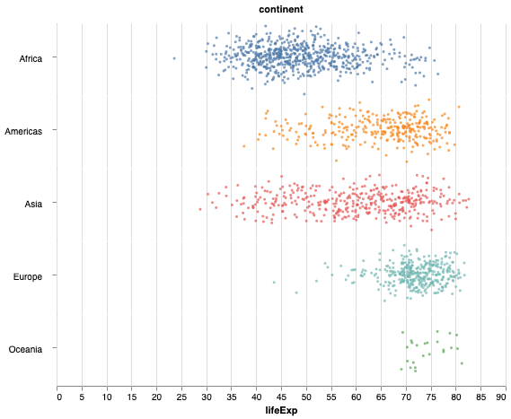
In this post, we will learn how to make horizontal stripplot with jitter using Altair in Python. In an earlier post we learned step-by-step instructions to make stripplot with jitter. We will use gapminder dataset to make the stripplot with Altair. Let us load the data from web using Pandas’s read_csv() function. We will primarily… Continue reading Horizontal Stripplot with Jitter using Altair in Python
Overlapping Histograms with Matplotlib in Python

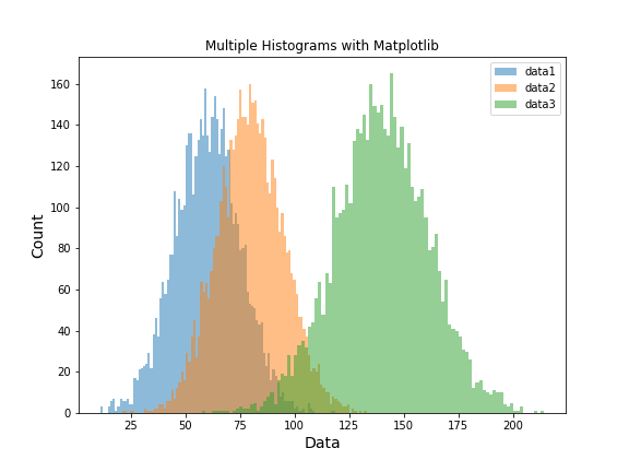
Histograms are one of the most common ways to visualize the distribution of data. While a single histogram shows the shape of one variable, often we want to compare two or more distributions directly. In this post, we’ll learn how to plot multiple overlapping histograms using Matplotlib in Python. Setup: Import Libraries We’ll use matplotlib.pyplot… Continue reading Overlapping Histograms with Matplotlib in Python
How To Make Ridgeline Plot with ggridges in R?

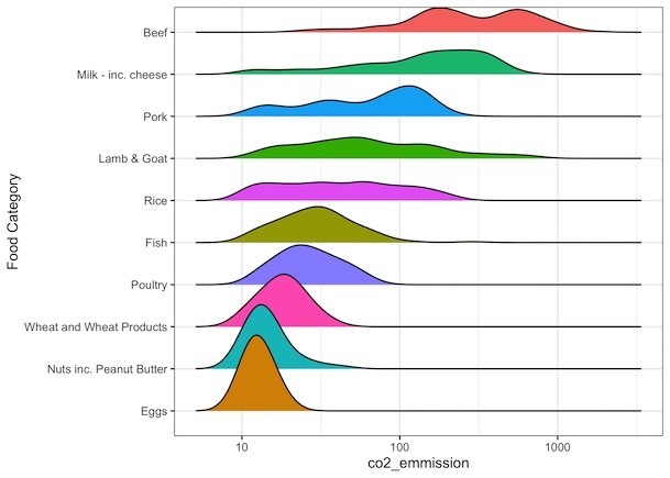
Ridgeline plot is one of the data visualization techniques that is suitable for visualizing multiple distributions or changes in distributions over time or space. Claus Wilke made created this plot and a package in R to make this easily. He defines it as a partially overlapping line plots that create the impression of a mountain… Continue reading How To Make Ridgeline Plot with ggridges in R?
How To Make Stripplot with Jitter in Altair Python?

In this post we will learn how to make strip plots using Altair in Python. A simple strip plot is plotting the data as points and may not that useful. One way to make the simple striplplot more meaningful is to add random jitter. Making a stipplot with jitter in Altair is slightly tricky. Luckily,… Continue reading How To Make Stripplot with Jitter in Altair Python?
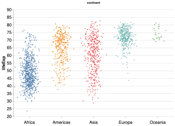
How To Make Grouped Boxplot with Seaborn Catplot?

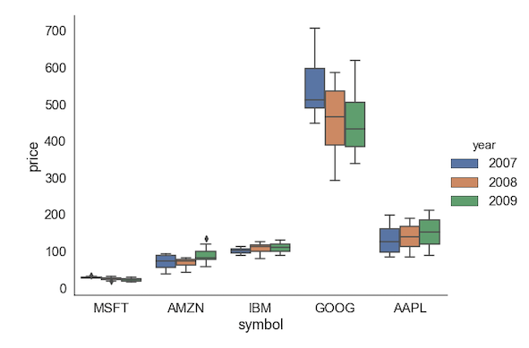
When you have a multiple groups and subgroups within each groups with associated numerical values, we can use Grouped boxplots to visualize. With Seaborn we can make grouped boxplots using boxplot() function and much newer function Catplot(). Seaborn Catplot is a function that unifies multiple data visualization techniques, including boxplots, when you have a numerical… Continue reading How To Make Grouped Boxplot with Seaborn Catplot?