

Making tables as part of your data visualization strategy can be a hit or miss. For example, a table with too many numbers screams for a plot instead of a table. Basically, challenge lies in using tables at the right time in right way. Luckily, we are in a much better position to make beautiful… Continue reading 6 Tips to Make Beautiful Tables with R Package gt
How to Make Histograms with Density Plots with Seaborn histplot?

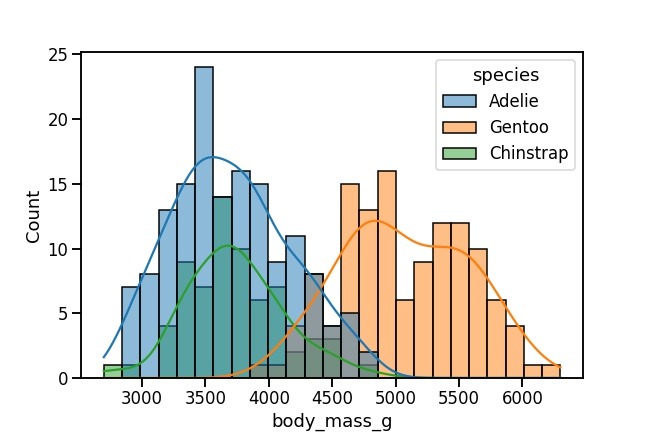
In this tutorial, we will see how to make a histogram with a density line using Seaborn in Python. With Seaborn version 0.11.0, we have a new function histplot() to make histograms. Here, we will learn how to use Seaborn’s histplot() to make a histogram with density line first and then see how how to… Continue reading How to Make Histograms with Density Plots with Seaborn histplot?
How To Make Heatmaps in R with ComplexHeatmap?

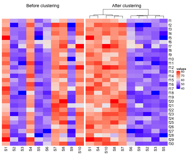
Heatmaps are a great way visualize a numerical dataset in a matrix form. Basically, a heatmap shows the actual data values as colors. When there is a broad trend in data, like change in data over rows or columns of data, a heat map makes it easy to see the broader trend. In this tutorial,… Continue reading How To Make Heatmaps in R with ComplexHeatmap?
How to Make Heatmaps in R with pheatmap?
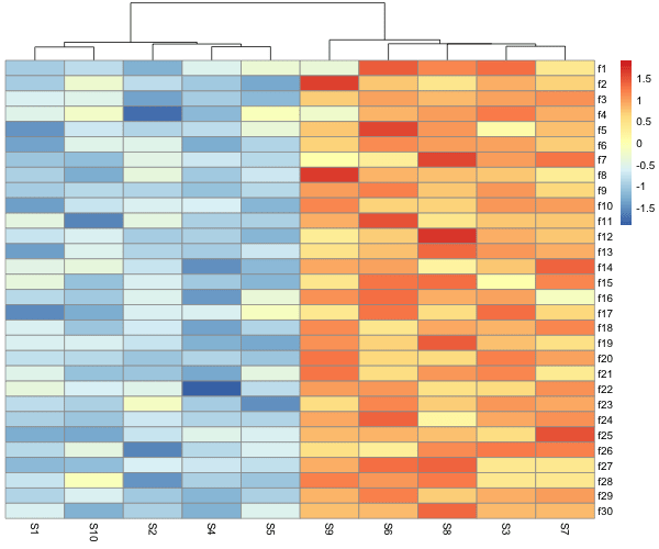
Heatmaps are one of the ways to visualize quantitative data in two dimension. Heatmaps show the actual data as colors and can reveal common patterns easily. In R, there are multiple ways to make heatmap starting from data in matrix form. In this post, we will learn how to make simple heatmaps with using pheatmap… Continue reading How to Make Heatmaps in R with pheatmap?
How To Adjust Positions of Axis Labels in Matplotlib?

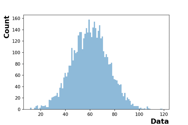
In this post, we will learn how to adjust positions of x-axis and y-axis labels in Matplotlib in Python. By default, plots with matplotlib places the axis labels in the middle. With matplotlib version 3.3.0, the matplotlib functions set_xlabel and set_ylabel have a new parameter “loc” that can help adjust the positions of axis labels.… Continue reading How To Adjust Positions of Axis Labels in Matplotlib?