
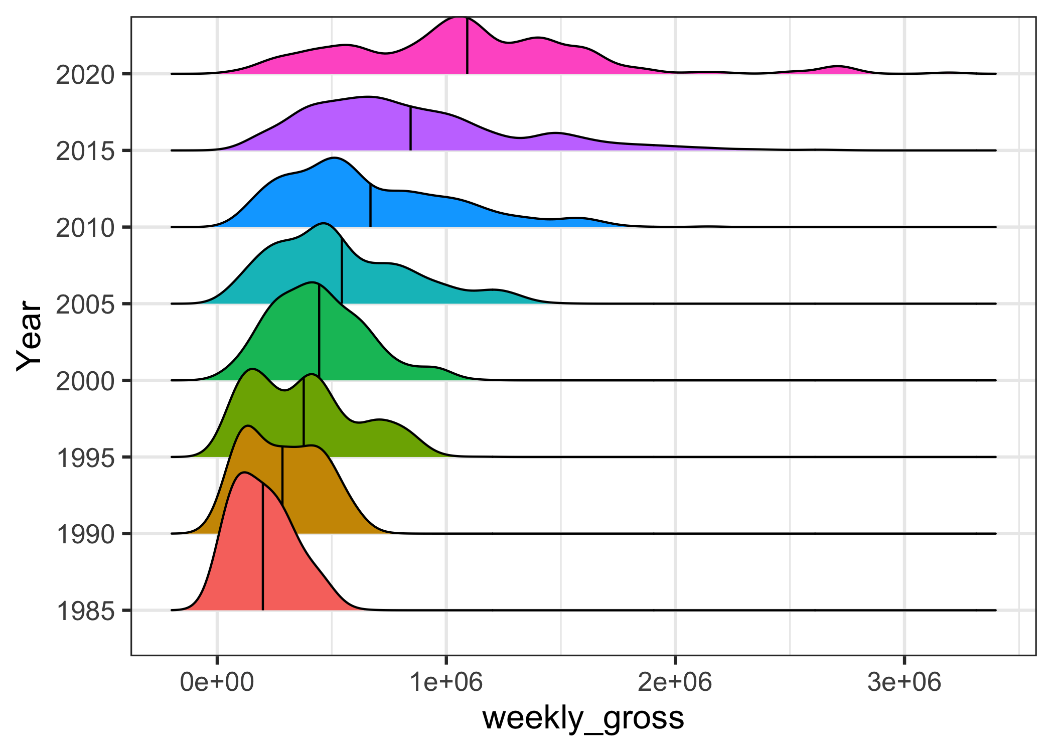
In this post, we will learn how to add mean line to ridgeline plot. We can make ridgeline plot in R with ggridges R package developed Claus Wilke. Ridgeline plot is useful when you have multiple distributions or a distribution that changes in distributions over time or space. The name “ridgeline” comes from the way… Continue reading How To Add Mean Line to Ridgeline Plot in R with ggridges?
Category: ggplot2
How to Add Labels Over Each Bar in Barplot in R?

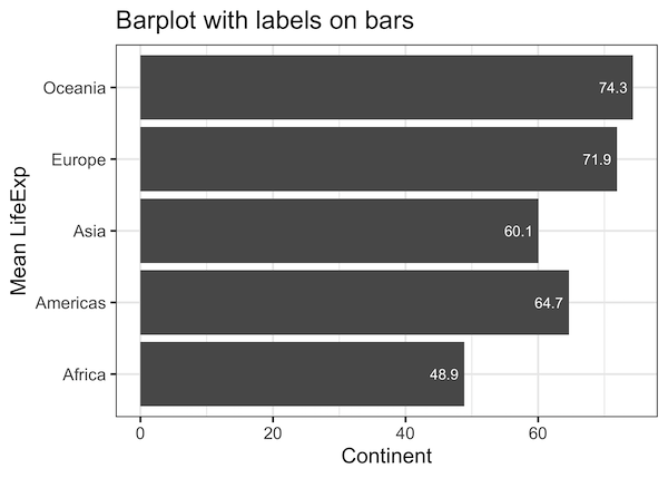
Adding text annotations over a barplot can be useful in quickly conveying the core message of a plot. In this post, we will see example of how to add text labels or text annotations over each bar in barplot. Barplot is great way to visualize numerical values corresponding to categorical variables. The height of the… Continue reading How to Add Labels Over Each Bar in Barplot in R?
How To Make Simple Animation in R?

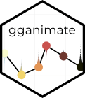
In this post, we will learn to make simple animation in R using gganimate package. gganimate R package is a powerful package to make animation using R. gganimate extends the grammar of graphics as implemented by ggplot2 to include the description of animation. It does this by providing a range of new grammar classes that… Continue reading How To Make Simple Animation in R?
How To Make Scatter Plot with Regression Line with ggplot2 in R?
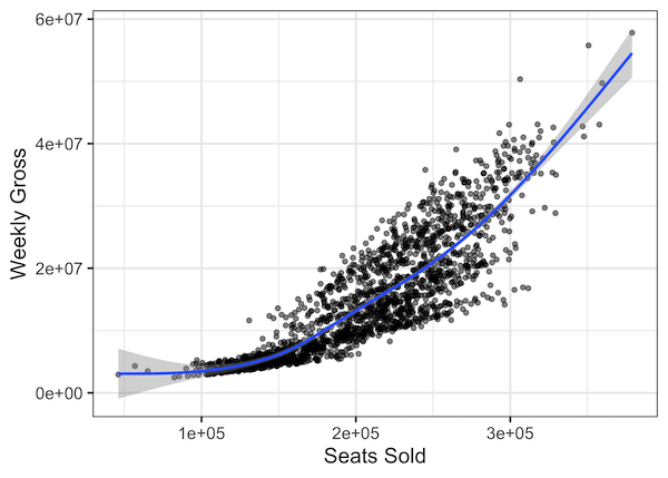
Adding regression line to scatter plot can help reveal the relationship or association between the two numerical variables in the scatter plot. With ggplot2, we can add regression line using geom_smooth() function as another layer to scatter plot. In this post, we will see examples of adding regression lines to scatterplot using ggplot2 in R.… Continue reading How To Make Scatter Plot with Regression Line with ggplot2 in R?
How To Make Facet Plot using facet_wrap() in ggplot2?
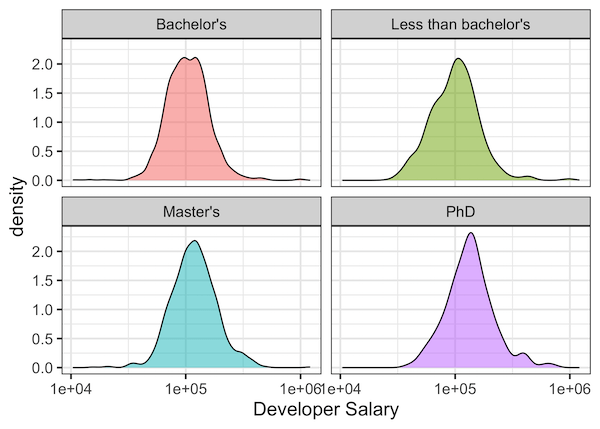
When you have data for a variable corresponding to multiple groups, visualizing the data for each group can be useful. One of the techniques to use is to visualize data from multiple groups in a single plot. However, a better way visualize data from multiple groups is to use “facet” or small multiples. ggplot2 makes… Continue reading How To Make Facet Plot using facet_wrap() in ggplot2?