
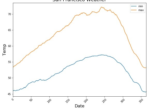
In this tutorial, we will learn how to make line plot or time series plot using Pandas in Python. Pandas’ plotting capabilities are great for quick exploratory data visualisation. Time Series plot is a line plot with date on y-axis. Let us load the packages needed to make line plots using Pandas. We will use… Continue reading Time Series Plot or Line plot with Pandas
Category: Python
How to Add Outline/Edge Color to Histogram in Seaborn?


In this tutorial, we will see an example of adding edge color/edge line to histograms made with Seaborn. Let us load the packages needed to make histogram with outlines using Seaborn. We will use Seattle weather data from vega_datasets to make histograms. Let us first make a histogram with Seaborn’s distplot. By default, distplot() fills… Continue reading How to Add Outline/Edge Color to Histogram in Seaborn?
Horizontal Boxplots with Points using Seaborn in Python
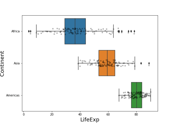
Horizontal boxplots are useful when you have lots of groups with longer names. If you make simple boxplots, the longer names would overlap on each other and make it impossible to read the group names. Horizontal boxplots solve that problem easily. In this post, we will see an example of making horizontal boxplots with data… Continue reading Horizontal Boxplots with Points using Seaborn in Python
Sort Boxplot by Mean with Seaborn in Python


Sorting a boxplot by mean or median values of each group is more helpful, when you are making a boxplot with multiple groups. In this post we will see an example of starting with a boxplot that is unordered and we will use Pandas and Seaborn to sort the boxplot by mean (and median). First,… Continue reading Sort Boxplot by Mean with Seaborn in Python
How to Make Boxplots with Data Points using Seaborn in Python
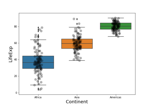
Boxplot with data points on top of it is often better visualization technique than the boxplots alone. This is mainly because, boxplot with data points actually shows the data underlying the boxplots, while the boxplot alone just shows the summary statistics. Always remember, Anscombe’s quartet, while using only summary statitics. In this tutorial, we will… Continue reading How to Make Boxplots with Data Points using Seaborn in Python