
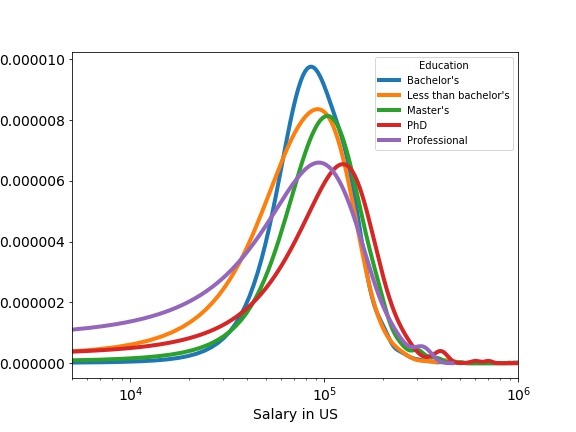
Often you may have data belonging to multiple groups. Visualizing them as multiple density plot is a great way to understand the similarities and differences between the groups. In this tutorial, we will learn how to make multi-density plot using Pandas in Python. We will use developer salary from US (from Stack Overflow survey) with… Continue reading Multiple Density Plots with Pandas in Python
Tag: Python
Density Plots with Pandas in Python
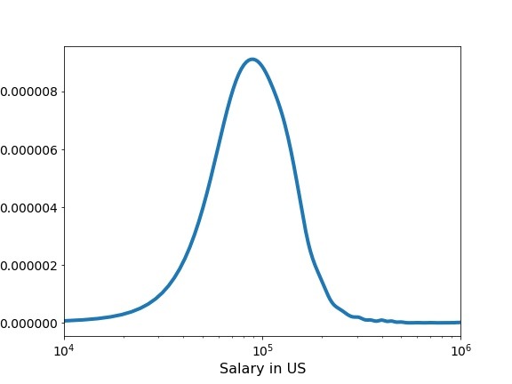
Pandas’ plot function is extremely useful in quickly making a variety of plots including density plots, boxplots and many more. In this post, we will see examples of making simple density plots using Pandas plot.density() function in Python. Let us first load the packages needed. We will use data from 2019 Stack Overflow developer survey.… Continue reading Density Plots with Pandas in Python
Time Series Plot or Line plot with Pandas
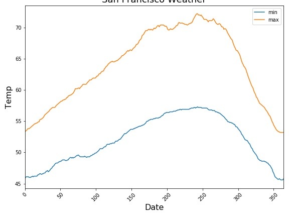
In this tutorial, we will learn how to make line plot or time series plot using Pandas in Python. Pandas’ plotting capabilities are great for quick exploratory data visualisation. Time Series plot is a line plot with date on y-axis. Let us load the packages needed to make line plots using Pandas. We will use… Continue reading Time Series Plot or Line plot with Pandas
How to Add Outline/Edge Color to Histogram in Seaborn?


In this tutorial, we will see an example of adding edge color/edge line to histograms made with Seaborn. Let us load the packages needed to make histogram with outlines using Seaborn. We will use Seattle weather data from vega_datasets to make histograms. Let us first make a histogram with Seaborn’s distplot. By default, distplot() fills… Continue reading How to Add Outline/Edge Color to Histogram in Seaborn?
Change Axis Labels, Set Title and Figure Size to Plots with Seaborn

In this post we will see examples of how to change axis labels, how to increase the size of axis labels and how to set title for the plot made using Seaborn in Python. These three are most basic customizations a plot needs to make it useful. Let us load the packages we need to… Continue reading Change Axis Labels, Set Title and Figure Size to Plots with Seaborn