
In this tutorial, we will learn how to make line plot or time series plot using Pandas in Python. Pandas’ plotting capabilities are great for quick exploratory data visualisation. Time Series plot is a line plot with date on y-axis.
Let us load the packages needed to make line plots using Pandas.
import pandas as pd
import numpy as np
from vega_datasets import data
import matplotlib.pyplot as plt
We will use weather data for San Francisco city from vega_datasets to make line/time-series plot using Pandas.
# San Francisco Weather data from vega_datasets
sf_temps =data.sf_temps()
sf_temps.head()
The weather data contains two variable; temperature and date. We have temperature data for every hour of the day and is given as timestamp variable.
	temp	date
0	47.8	2010-01-01 00:00:00
1	47.4	2010-01-01 01:00:00
2	46.9	2010-01-01 02:00:00
3	46.5	2010-01-01 03:00:00
4	46.0	2010-01-01 04:00:00
Pandas plot() function enables us to make a variety of plots right from Pandas. Let us try to make a simple plot using plot() function directly using the temp column.
sf_temps['temp'].plot()
Our first attempt to make the line plot does not look very successful. We get a plot with band for every x-axis values.

The reason is that our data frame contains temperature data for every hour in day and it changes over a data. By trying to make line plot with all the data we get a band showing the minimum and maximum temperature for every data. Also note that since directly plotted we get indices on x-axis not date.
Let us format our data so that we can make line plots with data point for each day.
Let us first remove the hours/secons information from the date variable. To do that we convert the datestamp format data to simply date format. And now we have only dates on date column.
sf_temps['date']=sf_temps['date'].dt.date
sf_temps.head()

temp	date
0	47.8	2010-01-01
1	47.4	2010-01-01
2	46.9	2010-01-01
3	46.5	2010-01-01
4	46.0	2010-01-01
Let us compute minimum and maximum temperatures for each day using Pandas groupby() function followed by agg() function.
df = sf_temps.groupby('date').agg(['min','max'])
And we get minimum and maximum temperature for each day.
df.head()

temp
min	max
date
2010-01-01	45.8	53.3
2010-01-02	46.0	53.4
2010-01-03	46.1	53.5
2010-01-04	46.1	53.6
2010-01-05	46.1	53.8
Now the dataframe is multi-indexed, so we will flatten the multi-index dataframe to make a dataframe with columns using Pandas functions; droplevel() and reset_index().
df.columns=df.columns.droplevel(0)
df.reset_index(level=0, inplace=True)
df.head()
	date	min	max
0	2010-01-01	45.8	53.3
1	2010-01-02	46.0	53.4
2	2010-01-03	46.1	53.5
3	2010-01-04	46.1	53.6
4	2010-01-05	46.1	53.8
Now we have the data as we needed to make line plots and time series plots.
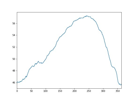
Let us first try the basic line plot as our first attempt, but this time with minimum temperature from the new data frame df.
df['min'].plot()
We get the simple line plot without any axis labels and index on x-axis.
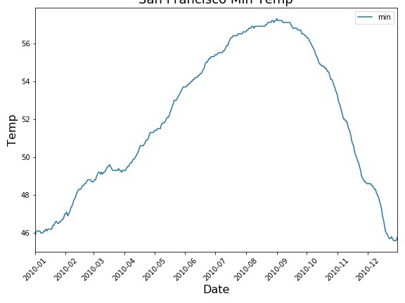
Now, let us try to make a time plot with minimum temperature on y-axis and date on x-axis. We can use plot() function directly on the dataframe and specify x and y axis variables.
Let us also add axis labels using Matplotlib.pyplot options separately. It is possible to use lot of matplotlib features directly from Pandas plot function. However, for the sake of simplicity we are not using that feature.
df.plot(x="date",y="min")
plt.xlabel("Date",size=16)
plt.ylabel("Temp",size=16)
plt.title("San Francisco Min Temp", size=18)
And we get time series plot with date on x-axis instead of indices.

We can rotate x-axis ticks using the argument rot=45. In this example, we rotate to 45 degree.
df.plot(x="date",y="min", rot=45)
plt.xlabel("Date",size=16)
plt.ylabel("Temp",size=16)
plt.title("San Francisco Min Temp", size=18)
Now our time-series plot is more legible.
With Pandas plot() function we can plot multiple variables in a time series plot easily. In our data set we have two variables, min and maximum temperature.
We can us it to illustrate Pandas plot() function’s capability make plote with multiple variables.
We just need to call plot() function on the data frame directly.
df.plot(rot=45)
plt.xlabel("Date",size=16)
plt.ylabel("Temp",size=16)
plt.title("San Francisco Weather", size=24)
Pandas plot() function has made a line plot plot with both min and max temperature nicely in different colors. However, note that we have indices on x-axis.
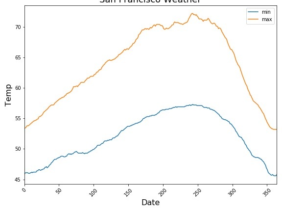
We can change the x-axis to date and make a time-series plot. To do that we will first reset the index of the data frame with our date variable. Now our dataframe data as index and we can call plot() directly to make time series plot.
df.set_index('date').plot(rot=45)
plt.xlabel("Date",size=16)
plt.ylabel("Temp",size=16)
plt.title("San Francisco Weather", size=18)
And now we have the time series plot with multiple variables using Pandas.


