Pandas’ plot function is extremely useful in quickly making a variety of plots including density plots, boxplots and many more. In this post, we will see examples of making simple density plots using Pandas plot.density() function in Python.
Let us first load the packages needed.
# import pandas
import pandas as pd
# import matplotlib
import matplotlib.pyplot as plt
We will use data from 2019 Stack Overflow developer survey. The survey data is processed and accessible from datavizpyr.com‘s github page.
stackoverflow_file = "https://raw.githubusercontent.com/datavizpyr/data/master/SO_data_2019/StackOverflow_survey_filtered_subsampled_2019.csv"
# load Stack Overflow survey data
survey = pd.read_csv(stackoverflow_file)
survey.head()

  CompTotal	Gender	Manager	YearsCode	Age1stCode	YearsCodePro	Education
0	180000.0	Man	IC	25	17	20	Master's
1	55000.0	Man	IC	5	18	3	Bachelor's
2	77000.0	Man	IC	6	19	2	Bachelor's
3	67017.0	Man	IC	4	20	1	Bachelor's
4	90000.0	Man	IC	6	26	4	Less than bachelor's
Let us subset the data to contain education and annual salary information. And we will also filter our low annual salary rows.
salary = survey[['CompTotal','Education']].dropna()
salary = salary.query("CompTotal > 25000")
# save the data to a file
salary.to_csv("2019_Stack_Overflow_Survey_Education_Salary_US.tsv", sep="\t", index=False)
salary.head()


CompTotal	Education
0	180000.0	Master's
1	55000.0	Bachelor's
2	77000.0	Bachelor's
3	67017.0	Bachelor's
4	90000.0	Less than bachelor's
Basic Density Plot with Pandas Using plot.density()
Let us first make a simple density plot to see the distribution of developer salary in US using Pandas. We will use Pandas’ plot function and its accessor density() function to make the density plot.
salary.CompTotal.plot.density(figsize=(8,6),
                              fontsize=14,
                              xlim=(10000,1e6),
                              linewidth=4)
plt.xlabel("Salary in US",size=16)
plt.savefig("Simple_density_plot_with_Pandas_Python.jpg")
In this example for simple density plot, we specify the thickness of the density line, x-axis values limit, and font size. Due to the outliers with large annual salary, we can see that the density plot is skewed towards left with a long tail.
Density Plot on log-scale with Pandas
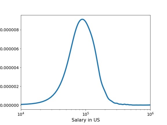
A better way to make the density plot is to change the scale of the data to log-scale. Density plot on log-scale will reduce the long tail we see here.
We can change to log-scale on x-axis by setting logx=True as argument inside plot.density() function.
salary.CompTotal.plot.density(figsize=(8,6),
                              logx=True,
                              fontsize=14,
                              xlim=(10000,1e6),
                              linewidth=4)
plt.xlabel("Salary in US",size=16)
plt.savefig("density_plot_with_log_scale_Pandas_Python.jpg")
Now our density plot on log-scale looks much better when compared to the density plot on original data.
Density Plot with Pandas Using plot.kde()
In addition to plot.density() function, Pandas also has plot.kde() function which can make density plots. KDE stands for kernel density estimation and it is a non-parametric technique to estimate the probability density function of a variable.
We can use plot.kde() function to make multiple density plots on log scale as we made the plot using plot.density() function.
salary.CompTotal.plot.kde(figsize=(8,6),
                              logx=True,
                              fontsize=14,
                              xlim=(10000,1e6),
                              linewidth=4)
plt.xlabel("Salary in US",size=16)
plt.savefig("density_plot_with_log_scale_using_kde_Pandas_Python.jpg")
