Often you may have data belonging to multiple groups. Visualizing them as multiple density plot is a great way to understand the similarities and differences between the groups.
In this tutorial, we will learn how to make multi-density plot using Pandas in Python. We will use developer salary from US (from Stack Overflow survey) with different educational qualification to make multiple density plots using Pandas.
Let us first load the processed data from Stack Overflow survey. We have the processed data at datavizpyr.com’s github.
# salary data derived from https://datavizpyr.com/density-plots-with-pandas-in-python/
stackoverflow_salary_file = "https://raw.githubusercontent.com/datavizpyr/data/master/SO_data_2019/2019_Stack_Overflow_Survey_Education_Salary_US.tsv"
# load the salary data
salary = pd.read_csv(stackoverflow_salary_file, sep="\t")
salary.head()

	CompTotal	Education
0	180000.0	Master's
1	55000.0	Bachelor's
2	77000.0	Bachelor's
3	67017.0	Bachelor's
4	90000.0	Less than bachelor's
By visualizing the distribution of developer salary with different levels of education as multi-density plot, we can understand the effect of degrees on developer salary in US.
We can make multiple density plots with Pandas’ plot.density() function. Check here for making simple density plot using Pandas.
However, the density() function in Pandas needs the data in wide form, i.e. each group’s values in their own columns.
We can reshape the dataframe in long form to wide form using pivot() function.
salary_wide=salary.pivot(columns='Education',values='CompTotal')
Now we have our data in right form to make multiple density plots using Pandas.
salary_wide.head()

Education	Bachelor's	Less than bachelor's	Master's	PhD	Professional
0	NaN	NaN	180000.0	NaN	NaN
1	55000.0	NaN	NaN	NaN	NaN
2	77000.0	NaN	NaN	NaN	NaN
3	67017.0	NaN	NaN	NaN	NaN
4	NaN	90000.0	NaN	NaN	NaN
How To Make Multiple Density Plots with Pandas?
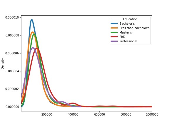
We can use salary data in wide form and use plot.density() function on it to make multiple density plots. Pandas plot.density() function will make density plots of all the variables in the wide dataframe. In this case we have five groups and we will have five density plots on the same plot.
salary_wide.plot.density(figsize=(8,6),xlim=(5000,1e6),linewidth=4)
plt.savefig("multiple_density_plots_with_Pandas_Python.jpg")
In this density plot, we specify x-axis limits to focus on reasonable x-axis values. Note, Pandas knows to color each density plot differently. Also, Pandas nicely assigns labels for each density plot.
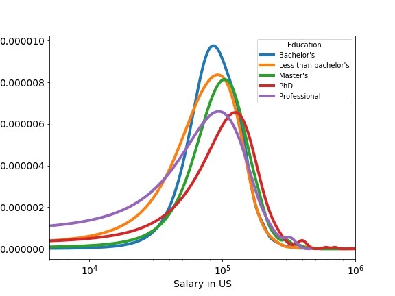
As we saw before, we have long tail for the density plot and we can use log-scale on x-axis with multiple density plot to make the plot look better. We can make the x-axis scale to log-scale with logx=True argument inside density() function.
salary_wide.plot.density(figsize=(8,6),
                         logx=True,
                         xlim=(5000,1e6),
                         linewidth=4,
                         fontsize=14)
plt.xlabel("Salary in US", size=14)
plt.savefig("Multiple_density_plots_with_log_scale_Pandas_Python.jpg")
With log-scale on multiple density plot, we can clearly see the effect of education on deeloper’s salary. We can see that on an average, developers with PhD make more money than others; closely followed by developers with Master’s degree.