Heatmaps are perfect for showing patterns across two categorical axes (e.g., months × years) with a numeric value mapped to color. Heatmaps make it easy to spot seasonality, gradients, clusters, and outliers in two-dimensional data. In Python, Seaborn’s heatmap() makes it easy to build polished heatmaps with labels, colorbars, and annotations.
This tutorial uses Seaborn’s Flights dataset, which records monthly airline passengers from 1949–1960 to create heatmaps.
You’ll learn how to reshape data into a matrix, customize the colormap, annotate values, and export publication-quality figures.
Step 1 — Import Libraries
Before plotting, set up a reliable environment. In practice, most heatmap workflows use pandas for data manipulation, Seaborn for high-level plotting, and Matplotlib for finishing touches like figure size and saving to file.
Establishing a consistent theme up front keeps charts visually coherent across a notebook or project. This is especially helpful when you produce multiple figures for a report and want them to share typography, spacing, and overall look without repeatedly tuning style in every cell.
import pandas as pd
import seaborn as sns
import matplotlib.pyplot as plt

# Nice base theme
sns.set_theme(style="white")
Step 2 — Load the Flights Dataset
Using a real dataset gives the heatmap a compelling story. The Seaborn “flights” data contains monthly passenger counts for an airline from 1949 to 1960. This kind of time-by-time table is a perfect candidate for heatmaps: it contains a seasonal pattern (months) and a long-term trend (years). Always peek at the first few rows to confirm types and spot obvious anomalies before you reshape or visualize the data.
flights = sns.load_dataset("flights")
flights.head()

	year	month	passengers
0	1949	Jan	112
1	1949	Feb	118
2	1949	Mar	132
3	1949	Apr	129
4	1949	May	121
Step 3 — Pivot to a Matrix (Months × Years)
Seaborn’s heatmap() expects a rectangular matrix where rows and columns represent categories, and the cell value encodes the metric of interest. The flights dataset starts in tidy “long” form (one row per month–year).
We’ll use pivot() to reshape into “wide” form with months as rows, years as columns, and the value as passenger counts. Ordering months chronologically (not alphabetically) makes scan patterns natural and prevents misinterpretation by readers.
# ✅ Modern pandas: use keyword arguments
heatmap_data = flights.pivot(index="month", columns="year", values="passengers")

heatmap_data.iloc[1:5,1:5]
year	1950	1951	1952	1953
month
Feb	126	150	180	196
Mar	141	178	193	236
Apr	135	163	181	235
May	125	172	183	229
Note: Months will appear alphabetically by default. Let’s order them Jan → Dec for readability.
# Order months properly (Jan -> Dec)
month_order = ["January","February","March","April","May","June",
               "July","August","September","October","November","December"]
heatmap_data = heatmap_data.loc[month_order]
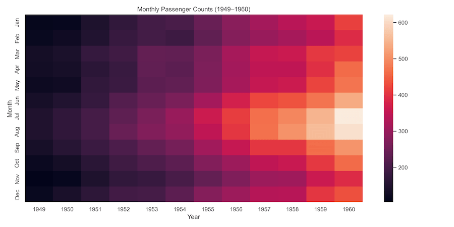
Step 4 — First Heatmap (Defaults)
Before polishing, it’s smart to make a basic heatmap to verify orientation and values. This quick check can catch common issues like transposed axes, mislabeled months, or unexpected ranges.
At this stage, you’re not aiming for aesthetics; you’re simply testing that each row is a month, each column is a year, and color intensity makes sense for your data. Fixing structure early saves time before you invest in styling.
plt.figure(figsize=(12, 6))
sns.heatmap(heatmap_data)  # defaults include a colorbar
plt.xlabel("Year")
plt.ylabel("Month")
plt.title("Monthly Passenger Counts (1949–1960)")
plt.tight_layout()
plt.savefig("flights_heatmap_default.png", dpi=300)
plt.show()

Step 5 — Change the Colormap
Colormaps shape perception. For quantities that move in one direction (like counts), a sequential palette communicates magnitude clearly from light to dark. Diverging palettes emphasize distance from a central baseline, which is useful for anomalies or signed differences.
Accessibility matters, too: favor colorblind-friendly, perceptually uniform palettes. The goal is to tell an honest visual story where the mapping between value and color is intuitive and doesn’t rely on tricky hues that some viewers can’t distinguish.
For counts/intensity that increase in one direction, use a sequential map (e.g., YlGnBu, magma, rocket). For values that diverge around a meaningful center (e.g., zero), use a diverging map (e.g., coolwarm). Reverse any map with _r (e.g., magma_r).
plt.figure(figsize=(12, 6))
sns.heatmap(heatmap_data, cmap="YlGnBu")
plt.xlabel("Year")
plt.ylabel("Month")
plt.title("Monthly Passenger Counts (YlGnBu)")
plt.tight_layout()
plt.savefig("flights_heatmap_ylgnbu.png", dpi=300)
plt.show()

Try others: "magma", "rocket", "YlOrRd", "viridis". Reverse by appending _r (e.g., "magma_r").
Step 6 — Annotate Values & Improve the Legend
Heatmaps excel at pattern recognition but can hide exact values. Using colors alone can trick people- see illustrations in the next step. Adding annotations puts precise numbers in context while thin gridlines make rows and columns easier to track.
A labeled colorbar translates color back into units so readers don’t have to guess. Keep density in mind: on very large matrices, annotating every cell will overwhelm the figure. In those cases, annotate highlights only or rely on the colorbar and a caption explaining the scale.
plt.figure(figsize=(12, 6))
ax = sns.heatmap(
    heatmap_data,
    cmap="YlOrRd",
    annot=True, fmt="d",         # show values (integers)
    linewidths=0.5, linecolor="white",
    cbar_kws={"shrink": 0.8, "label": "Passengers"}
)
ax.set_xlabel("Year")
ax.set_ylabel("Month")
ax.set_title("Monthly Passenger Counts (Annotated)")
plt.tight_layout()
plt.savefig("flights_heatmap_annotated.png", dpi=300)
plt.show()
Tip: For large matrices, annotations can clutter; either increase figure size or annotate selectively (e.g., only show maxima).

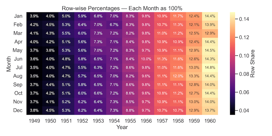
Step 7 — Normalize & Show Percentages
Absolute counts are useful, but sometimes the shape of distribution matters more than totals. Normalizing by row or column reveals proportions: for instance, what fraction of each month’s traffic falls in each year, or vice versa.
This is a powerful way to compare patterns across categories when the overall scale changes over time. In the flights data, row-wise normalization highlights seasonal consistency despite long-term growth in total passengers.
# Row-wise percentages (each month sums to 1.0)
row_pct = heatmap_data.div(heatmap_data.sum(axis=1), axis=0)

plt.figure(figsize=(12, 6))
sns.heatmap(row_pct,
            cmap="magma", annot=True, fmt=".1%",
            annot_kws={"size": 12},
            cbar_kws={"label": "Row Share"})
plt.xlabel("Year"); plt.ylabel("Month")
plt.title("Row-wise Percentages — Each Month as 100%")
plt.tight_layout()
plt.savefig("flights_heatmap_row_percent.png", dpi=300)
plt.show()
Step 8 — Fair Comparisons with Shared vmin/vmax
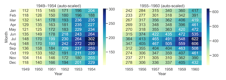
Comparing multiple heatmaps is often useful when done right. The similarities between two heatmaps can be misleading if each one auto-scales its colors. Two panels may look equally intense even when values differ dramatically.
To fix this, compute a global minimum and maximum across all panels and pass them as vmin/vmax. With a shared scale, color means the same thing everywhere. This is essential for honest comparisons across time windows, geographies, or segments in dashboards and reports.
# Split into two periods
early_years = [1949, 1950, 1951, 1952, 1953, 1954]
late_years  = [1955, 1956, 1957, 1958, 1959, 1960]

early = heatmap_data[early_years]
late  = heatmap_data[late_years]

# Shared color range across both panels
vmin = min(early.min().min(), late.min().min())
vmax = max(early.max().max(), late.max().max())
By default, each heatmap uses its own min/max, which can mislead when comparing panels. Lock the color scale across plots to ensure colors represent the same values everywhere.
# A) Auto-scaled — NOT comparable
fig, axes = plt.subplots(1, 2, figsize=(14, 5), sharey=True)
sns.heatmap(early,
            cmap="YlGnBu",
            ax=axes[0],
            annot=True,
            fmt="d")
axes[0].set_title("1949–1954 (auto-scaled)")
sns.heatmap(late,
           cmap="YlGnBu",
           ax=axes[1],
           annot=True,
           fmt="d")
axes[1].set_title("1955–1960 (auto-scaled)")
for ax in axes: ax.set_xlabel("Year")
   axes[0].set_ylabel("Month");
   axes[1].set_ylabel("")
plt.tight_layout();
plt.savefig("flights_heatmap_autoscaled.png", dpi=300);
plt.show()

A fair comaprison, where a global minimum and maximum are computed across all heatmaps and passed them as vmin/vmax.
# B) Shared scale — FAIR comparison
fig, axes = plt.subplots(1, 2, figsize=(14, 5), sharey=True)
sns.heatmap(early,
            cmap="YlGnBu",
            vmin=vmin,
            vmax=vmax,
            ax=axes[0],
            annot=True, fmt="d",
            cbar_kws={"label": "Passengers"})
axes[0].set_title("1949–1954 (shared scale)")
sns.heatmap(late,
            cmap="YlGnBu",
            vmin=vmin,
            vmax=vmax,
            ax=axes[1],
            annot=True,
            fmt="d",
            cbar_kws={"label": "Passengers"})
axes[1].set_title("1955–1960 (shared scale)")
for ax in axes: ax.set_xlabel("Year")
    axes[0].set_ylabel("Month");
    axes[1].set_ylabel("")
plt.tight_layout();
plt.savefig("flights_heatmap_shared_scale.png", dpi=300);
plt.show()

Step 9 — Publication Quality Figures
The value of a heatmap or any chart ultimately depends on how it appears in reports/slides/dash board. Export PNGs at 300 DPI for screens and PDFs/SVGs for vector clarity in print. Use tight_layout and bbox_inches=’tight’ to avoid cropped titles or tick labels.
If you still see cutoffs, try constrained_layout=True when creating the figure. These finishing touches make your figures look intentional and professional in any medium.
sns.set_context("talk")  # bigger base fonts
plt.figure(figsize=(10, 6))
sns.heatmap(heatmap_data,
            cmap="YlGnBu",
            #cmap="rocket",
            cbar_kws={"label": "Passengers"})
plt.xlabel("Year")
plt.ylabel("Month")
plt.title("Monthly Passenger Counts (Publication-Ready)")
plt.tight_layout()
plt.savefig("seaborn_heatmap_publication_quality.png", dpi=300, bbox_inches="tight")
plt.savefig("seaborn_heatmap_publication_quality.pdf", bbox_inches="tight")
plt.show()


Tips on Handling NaNs, Skew, & Dense Labels
Handling Missing Values – NaNs
- Default: NaNs render as empty cells.
- Mask explicitly:
sns.heatmap(data, mask=data.isnull()) - Fill cautiously (e.g., 0 or row means) and disclose in the caption.
Skew / Outliers
- Outliers can flatten variation; consider clipping with fixed
vmin/vmax. - Or use robust scaling: compute scale from percentiles (e.g., 5th–95th).
Tick Readability
- Increase
figsize, rotate ticks, abbreviate labels. - Show every n-th tick:
ax.set_xticks(ax.get_xticks()[::2]) - Use
sns.set_context('talk')or'poster'for larger fonts.
Large Matrices
- For very large matrices,
annot=Truecan slow rendering and balloon file sizes. Consider aggregating (e.g., daily → weekly), sampling, or switching to interactive libraries for exploration (Plotly, Altair), then exporting a static summary for publication. Caching intermediate results and reusing a shared color scale also speeds up reproducibility when generating many figures in batch.
Troubleshooting Common Errors
-
TypeError: pivot() takes 1 positional argument but 4 were given — Use keyword arguments in the new versions of Pandas:
pivot(index=, columns=, values=). -
KeyError on month order — Check how months are encoded. The flights dataset uses abbreviations. Reindex with
['Jan','Feb',...,'Dec']. -
Title cut off in saved PNG — Add
plt.tight_layout()and save withbbox_inches='tight'; or create figure withconstrained_layout=True.
FAQs
-
How do I keep the same color scale across a report or dashboard?
Decide globalvmin/vmaxbased on domain knowledge or pooled min/max. Store them in variables and reuse in every plot call. -
How can I annotate only certain cells (like maxima)?
Compute indices of interest (e.g., where value equals row max) and addax.text(x, y, value, ...)selectively after drawing the heatmap. -
How do I show percentages by row/column?
Normalize along an axis:data.div(data.sum(axis=1), axis=0)(row-wise) ordata.div(data.sum(axis=0), axis=1)(column-wise), thenfmt='.1%'. -
My data has negative and positive values — which colormap?
Use a diverging map (e.g.,vlag,coolwarm) and setcenter=0so color splits at zero. -
What if I have categorical event counts instead of numeric magnitude?
Usepd.crosstab(A, B)orpivot_table(..., aggfunc='size')to build a frequency matrix and pass it tosns.heatmap. -
How do I avoid misleading colors due to a single outlier?
Clipvmin/vmaxto a reasonable range or use percentiles (e.g., 5th–95th) to set the scale, then document the decision in the caption. -
Why does my plot look blurry when saved?
Increase DPI (e.g., 300–600) and usebbox_inches='tight'. For vector clarity in print, export.pdfor.svg.