
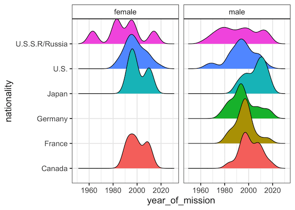
Facetting is a great way to show relationship between more than two variables. When you have three variables, with faceting one can splot a single plot into smaller plots with subset of data corresponding to the third variable. In ggplot2, we can easily make facetted plot using facet_wrap() function. When you use facet_wrap() in ggplot2,… Continue reading How To Change facet_wrap() Box Color in ggplot2?
Tag: ggplot2
How To Zoom in on a Plot in R?

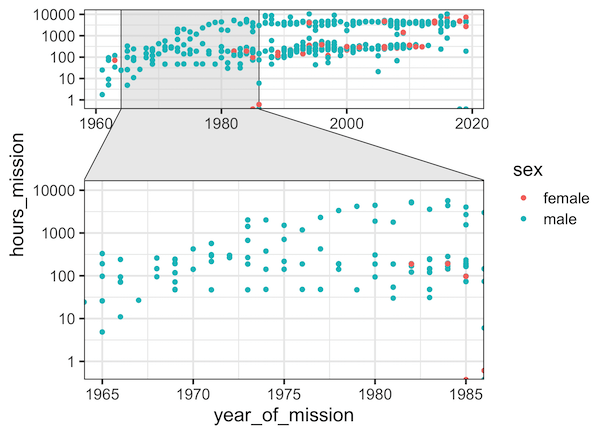
While making data visualization, often you might want show a bigger level picture and then zoom in on part of the plot. In this tutorial, we will see an example of how to zoom in on a part of plot made with ggplot2 in R. The package, ggforce, made by fantastic Thomas Lin Pedersen, can… Continue reading How To Zoom in on a Plot in R?
How To Add Regression Line per Group to Scatterplot in ggplot2?
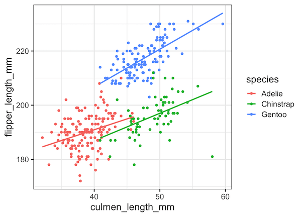
In this tutorial, we will learn how to add regression lines per group to scatterplot in R using ggplot2. In ggplot2, we can add regression lines using geom_smooth() function as additional layer to an existing ggplot2. We will first start with adding a single regression to the whole data first to a scatter plot. And… Continue reading How To Add Regression Line per Group to Scatterplot in ggplot2?
How To Make Grouped Violinplot with ggplot2 in R?
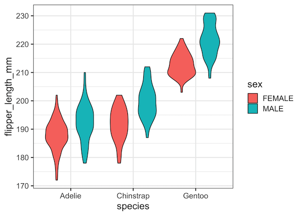
In this tutorial, we will see examples of how to make grouped violinplots using ggplot2’s geom_violin() function. Violinplots are like boxplot for visualizing numerical distributions for multiple groups. In comparison to boxplot, Violin plot adds information about density of distributions to the plot. A grouped violin plot is great for visualizing multiple grouping variables. Let… Continue reading How To Make Grouped Violinplot with ggplot2 in R?
Best ggplot2 Themes to Make Your R Plots Look Professional (2025 Guide)


Creating professional-looking data visualizations in R starts with choosing the right ggplot2 theme. While ggplot2’s default gray theme works for basic plots, selecting the right theme can transform your visualizations from amateur to publication-ready. In this comprehensive guide, you’ll discover 10+ ggplot2 themes that will make your R plots look professional and polished with literally… Continue reading Best ggplot2 Themes to Make Your R Plots Look Professional (2025 Guide)