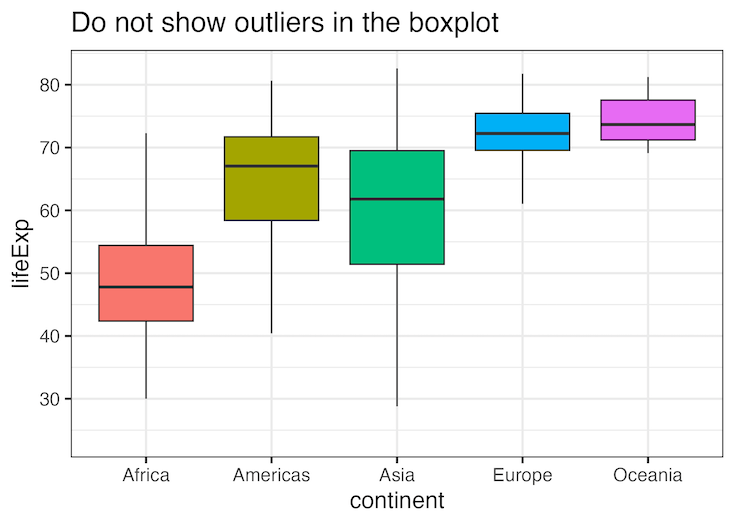
In this post, we will learn of two ways to deal with outlier data points while making a boxplot. By default, ggplot2 boxplot() identifies the outliers and disply them as black dots at the boxplot extremes. One of the options to deal with outlier is to ignore them. With ggplot2, there are two ways to… Continue reading How to Deal with Outliers in boxplot with ggplot2
How to Move Facet strip label to the bottom
In this tutorial, we will learn how to move the strip label title text in ggplot2’s facet* functions to the bottom. By default, facet_wrap() creates a box for each strip with a label at the top of the small multiple plot. In this post, we will show how to move the strip label to the… Continue reading How to Move Facet strip label to the bottom
4 Ways to have Plots Side by side in ggplot2
In this post, we will learn how to combine two plots side-by-side using four different approaches. First, we will show how we can use facet_wrap() function in ggplot2, if we are interested in similar plots (small multiples) side by side. Next three approaches are more general, i.e. combining any two plots side by side using… Continue reading 4 Ways to have Plots Side by side in ggplot2
How to add text annotation to heatmap with ggplot2
Want to display exact values or add custom labels to your heatmap cells? This comprehensive guide shows you exactly how to add ggplot2 heatmap text annotation using geom_text(), geom_label(), and advanced formatting techniques for professional data visualizations. Heatmaps are excellent for visualizing data patterns through color intensity, but sometimes you need to show precise values… Continue reading How to add text annotation to heatmap with ggplot2
How to directly add labels on a plot with ggrepel
In this tutorial, we will learn how to add legends to a plot made with ggplot2 directly on the plot, so that it is much easier to understand the plot. When you make a plot with ggplot, adding legends to explain the plot is of great help to understand a plot. By default, ggplot2 adds… Continue reading How to directly add labels on a plot with ggrepel
