• Skip to primary navigation
  • Skip to main content
  • Skip to primary sidebar

Data Viz with Python and R

Learn to Make Plots in Python and R

  • Home
  • Seaborn
  • Matplotlib
  • ggplot2
  • Altair
  • About
    • Privacy Policy
  • Visualizing Activation Functions in Neural Networks
  • Confusion Matrix Calculator
  • Visualizing Dropout Rate in Neural Network
  • Visualizing Loss Functions in Neural Networks
  • Show Search
Hide Search

How to Deal with Outliers in boxplot with ggplot2

datavizpyr · August 25, 2024 ·

outlier.shape=NA: do not show outlier data in the boxplot with ggplot2

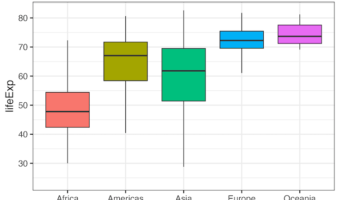
In this post, we will learn of two ways to deal with outlier data points while making a boxplot. By default, ggplot2 boxplot() identifies the outliers and disply them as black dots at the boxplot extremes. One of the options to deal with outlier is to ignore them. With ggplot2, … [Read more...] about How to Deal with Outliers in boxplot with ggplot2

Filed Under: ggplot2, R Tagged With: boxplot outliers

How to Move Facet strip label to the bottom

datavizpyr · August 21, 2024 ·

How to move the facet strip label to the bottom in ggplot2

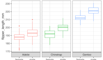
In this tutorial, we will learn how to move the strip label title text in ggplot2's facet* functions to the bottom. By default, facet_wrap() creates a box for each strip with a label at the top of the small multiple plot. In this post, we will show how to move the strip label to … [Read more...] about How to Move Facet strip label to the bottom

Filed Under: facet_wrap ggplot2, facet_wrap remove box, ggplot2, R Tagged With: move facet strip label

4 Ways to have Plots Side by side in ggplot2

datavizpyr · August 19, 2024 ·

Side by side plots in ggplot2 with gridExtra

In this post, we will learn how to combine two plots side-by-side using four different approaches. First, we will show how we can use facet_wrap() function in ggplot2, if we are interested in similar plots (small multiples) side by side. Next three approaches are more general, … [Read more...] about 4 Ways to have Plots Side by side in ggplot2

Filed Under: ggplot2, R Tagged With: side by side plots

How to add text annotation to heatmap with ggplot2

datavizpyr · August 7, 2024 ·

Customizing annotation to heatmap with ggplot2

Want to display exact values or add custom labels to your heatmap cells? This comprehensive guide shows you exactly how to add ggplot2 heatmap text annotation using geom_text(), geom_label(), and advanced formatting techniques for professional data visualizations. Heatmaps are … [Read more...] about How to add text annotation to heatmap with ggplot2

Filed Under: ggplot2, ggplot2 geom_raster(), ggplot2 geom_tile(), Heatmaps in R, Heatmaps with ggplot2, R Tagged With: annotate heatmap, text annotation to ggplot2 heatmap

How to directly add labels on a plot with ggrepel

datavizpyr · July 21, 2024 ·

How to directly add labels on a plot

In this tutorial, we will learn how to add legends to a plot made with ggplot2 directly on the plot, so that it is much easier to understand the plot. When you make a plot with ggplot, adding legends to explain the plot is of great help to understand a plot. By default, ggplot2 … [Read more...] about How to directly add labels on a plot with ggrepel

Filed Under: ggplot2, ggrepel, R Tagged With: add labels directly, ggrepel add labels

  • « Go to Previous Page
  • Page 1
  • Interim pages omitted …
  • Page 3
  • Page 4
  • Page 5
  • Page 6
  • Page 7
  • Interim pages omitted …
  • Page 55
  • Go to Next Page »

Primary Sidebar

Python & R Viz Hubs

  • Seaborn Guide & Cookbook
  • ggplot2 Guide & Cookbook
  • Matplotlib Guide & Cookbook
  • Confusion Matrix Calculator
  • Visualizing Activation Functions
  • Visualizing Dropout
  • Visualizing Loss Functions

Buy Me a Coffee

Copyright © 2026 · Daily Dish Pro on Genesis Framework · WordPress · Log in

Go to mobile version