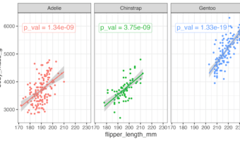
This tutorial shows you how to add p-value to each facet in ggplot2 when creating multi-panel plots in R. Using a scatter plot example, we’ll perform linear regression analysis for each facet to determine statistical significance. And then we will display the corresponding … [Read more...] about How to add P-value to each facet in ggplot2
How to make Annotated heatmap with Seaborn in Python

In this tutorial, you’ll learn how to create an annotated heatmap in Python using Seaborn, a powerful data visualization library built on Matplotlib. We’ll start by generating a basic heatmap with the heatmap() function to visualize data in a color-coded grid. Then, we’ll take it … [Read more...] about How to make Annotated heatmap with Seaborn in Python
How to Annotate Positive and Negative Values in a barplot

In this post, we will learn how to properly annotate a bars barplot, where there are both positive and negative values/bars in ggplot2. In ggplot2, we can use gem_text() with label option to annotate text or bar heights on a barplot easily. However, when we have a barplot that … [Read more...] about How to Annotate Positive and Negative Values in a barplot
How to Annotate a plot with P-value in ggplot2
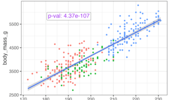
Adding statistical significance indicators to your data visualizations is crucial for communicating research findings effectively. When working with ggplot2 in R, displaying p-values directly on scatter plots helps viewers immediately understand the statistical relationship … [Read more...] about How to Annotate a plot with P-value in ggplot2
How to order facet variable in grouped boxplot by mean difference between groups in ggplot2

In this tutorial, we’ll dive into grouped boxplots using ggplot2 in R and demonstrate how to reorder facet variables based on the mean difference between groups. Imagine comparing sales performance across multiple regions or test scores across different schools—by reordering … [Read more...] about How to order facet variable in grouped boxplot by mean difference between groups in ggplot2