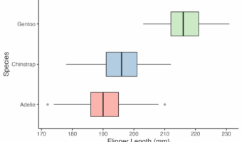
Boxplots are one of the most effective ways to summarize data distributions in R, and ggplot2 makes them both powerful and flexible. ggplot2 is the go-to package for making boxplots in R. What’s new is how you can now create them by working with AI tools like ChatGPT. Instead … [Read more...] about 10 ChatGPT Prompts for ggplot2 Boxplots: Complete Guide with Working R Code
ggplot2
AI vs Manual Scatterplots in R: ggplot2 Workflows for the AI Era
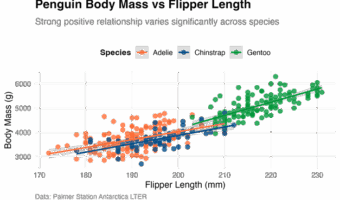
If you're creating scatterplots in R during 2025, you have likely wrestled with the question: should you let AI write your ggplot2 code, or stick to the tried-and-true manual approach? The answer isn't as simple as "AI is faster" or "manual is better." The reality is more … [Read more...] about AI vs Manual Scatterplots in R: ggplot2 Workflows for the AI Era
ggplot2 Boxplot AI Workflows: A Modern Guide
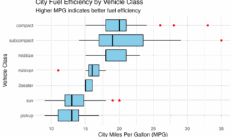
Boxplots in R: Manual, ChatGPT/AI, and Hybrid Approaches in the AI Era If you're a data analyst or scientist, your workflow in 2025 probably looks a lot different than it did just a few years ago. The buzz around AI coding assistants like GitHub Copilot and large language … [Read more...] about ggplot2 Boxplot AI Workflows: A Modern Guide
How to make UMAP plot in R

Struggling to visualize and find patterns in high-dimensional data? While PCA and tSNE are common, UMAP has emerged as a powerful, modern technique for dimensionality reduction. This guide will show you not only how to create beautiful UMAP plots in R with ggplot2, but also … [Read more...] about How to make UMAP plot in R
How To Rotate x-axis Text Labels in ggplot2
Struggling with unreadable, overlapping x-axis labels in your ggplot2 plots? This is a common problem, and this guide provides the definitive solution. Long category names, dates, or numerous data groups often cause x-axis labels to overlap, making plots unreadable and … [Read more...] about How To Rotate x-axis Text Labels in ggplot2