
In this post, we will learn how to properly annotate a bars barplot, where there are both positive and negative values/bars in ggplot2. In ggplot2, we can use gem_text() with label option to annotate text or bar heights on a barplot easily. However, when we have a barplot that … [Read more...] about How to Annotate Positive and Negative Values in a barplot
barplot ggplot2
3 Different ways to make bar plots with ggplot2

Creating effective bar plots in ggplot2 requires knowing which function to use for your data structure. This comprehensive guide demonstrates three essential approaches—geom_bar() for raw data, geom_col() for summarized values, and stat_count() for explicit control—with practical … [Read more...] about 3 Different ways to make bar plots with ggplot2
How to wrap long axis tick labels into multiple lines in ggplot2
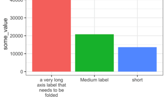
Dealing with long, overlapping axis labels that make your ggplot2 visualizations unreadable? This comprehensive guide shows you exactly how to wrap axis labels ggplot2 into multiple lines with ready-to-use code examples. Long axis labels are a common problem in data … [Read more...] about How to wrap long axis tick labels into multiple lines in ggplot2
How to add percentage label on bars in barplot with ggplot2
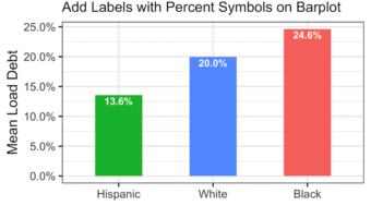
Adding percentage labels or count labels to bars in a barplot can help read the barplot quickly. In this tutorial, we will learn how to add labels with percentage symbol on bars in a barplot made with ggplot2 in R. Loading Packages and Dataset Let us get started by loading … [Read more...] about How to add percentage label on bars in barplot with ggplot2
How to Color Barplots with R Color Brewer
In this tutorial we will learn to how to color bars in a barplot using R Color Brewer's color palettes. R Color Brewer package "RColorBrewer" offers numerous color palettes that are useful in common situations. For example, it gives "Sequential" palette for ordered data, … [Read more...] about How to Color Barplots with R Color Brewer