
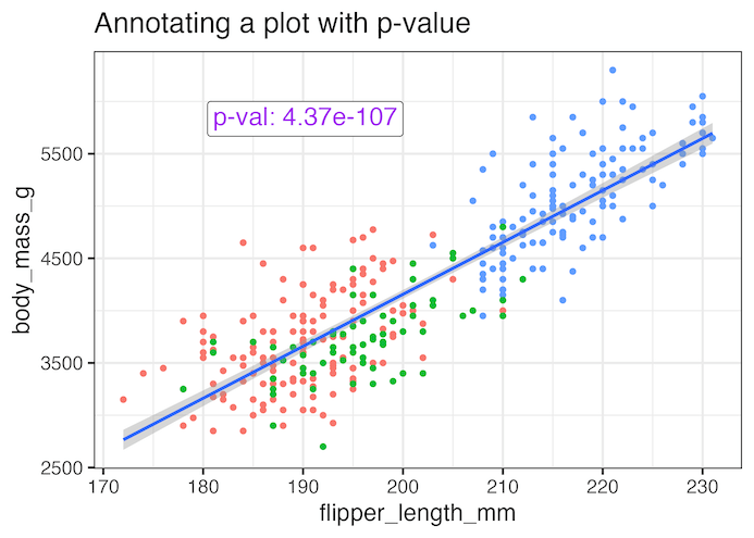
Adding statistical significance indicators to your data visualizations is crucial for communicating research findings effectively. When working with ggplot2 in R, displaying p-values directly on scatter plots helps viewers immediately understand the statistical relationship between variables. In this comprehensive tutorial, you’ll learn how to annotate ggplot2 plots with p-values from linear regression analysis. We’ll cover… Continue reading How to Annotate a plot with P-value in ggplot2
Category: ggtext
How to Add matching colors to keywords in title text


This tutorial teaches you how to color words in a ggplot title to match the data in the plot itself. This approach has two main benefits: Improves interpretation: Readers can understand the chart more quickly. Reduces clutter: It can eliminate the need for a separate color legend. We will use two R packages to accomplish… Continue reading How to Add matching colors to keywords in title text
How to add color to axis tick labels: Hint – element_markdown() in ggtext
In this tutorial, we will learn about a nice ggplot2 trick/tip that enables colored text on axis tick labels. Thanks to new theme element element_markdown() in ggtext, R package developed by Claus Wilke, we can add colors to axis text labels. To get started, let us load the packages needed. Here we use ggtext version… Continue reading How to add color to axis tick labels: Hint – element_markdown() in ggtext