
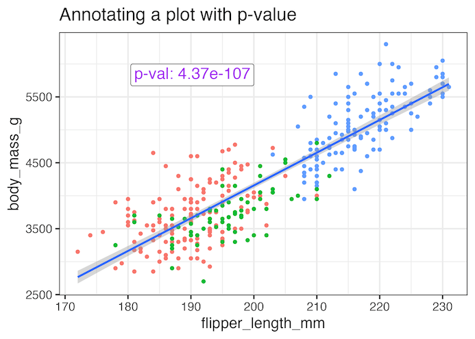
Adding statistical significance indicators to your data visualizations is crucial for communicating research findings effectively. When working with ggplot2 in R, displaying p-values directly on scatter plots helps viewers immediately understand the statistical relationship between variables. In this comprehensive tutorial, you’ll learn how to annotate ggplot2 plots with p-values from linear regression analysis. We’ll cover… Continue reading How to Annotate a plot with P-value in ggplot2