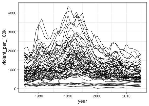
Line plots or time series plots are helpful to understand the trend over time. In this post we will learn how to make multiple line plots (or time-series plots in the sample plot) in R using ggplot2.
Let us load tidyverse the suite of R packages including ggplot2 to make the line plots.
library(tidyverse)
theme_set(theme_bw(base_size=16))
We will use crime data in US over time from the Marshall Project. We load the data from Marshall Project’s github page.
data_url <- "https://raw.githubusercontent.com/themarshallproject/city-crime/master/data/ucr_crime_1975_2015.csv"
crime_data <- read_csv(data_url)
We will be using three of the variables from the data, year and number of violent crimes per 100k of population in different city/town. The city/town information is in “department_name” variable.
crime_data %>%
  select(year, department_name, violent_per_100k) %>%
  head()

## # A tibble: 6 x 3
##    year department_name   violent_per_100k
##   <dbl> <chr>                        <dbl>
## 1  1975 Albuquerque, N.M.             833.
## 2  1975 Arlington, Texas              247.
## 3  1975 Atlanta                      1637.
## 4  1975 Aurora, Colo.                 524.
## 5  1975 Austin, Texas                 404.
## 6  1975 Baltimore                    1862.
Let us make line plots of violence rate over year for each of the city, i.e. department name. We can make line plot using the geom, geom_line() in ggplot2. In our example, we want year on x-axis and violent_per_100k on y axis for every region (department_name).
Our first instinct make such a line plot is to add the geom_line() layer after specifying x and y variables.
crime_data %>%
  ggplot(aes(x=year, violent_per_100k)) +
  geom_line()
And the resulting plot we got is not what we intended.
Basically, in our effort to make multiple line plots, we used just two variables; year and violent_per_100k. And we did not specify the grouping variable, i.e. region/department_name information in our data.
crime_data %>%
  ggplot(aes(x=year, violent_per_100k)) +
  geom_line(aes(group=department_name))
After we specify the grouping variable with aes(group=department_name) inside geom_line(), we get a nice multiple line plots with each line showing crime rate over time for each region.
