
Ridgeline plots are great to visualize numerical distributions corresponding to multiple groups or categorical variables. Ridgeline plots make density plots or histograms for each group one on top of each other and thus making it look like “a mountain range”. They are great for visualizing changes in numerical distributions over time or space. Claus Wilke created ridgeline plots in R with ggridges. Earlier it was called as Joy plots, now it is not a preferred name (Check the blogpost by Claus Wilke for the reasons) https://serialmentor.com/blog/2017/9/15/goodbye-joyplots.
👉 Want more? Explore the full Seaborn Tutorial Hub with 35+ examples, code recipes, and best practices.
In this post we will learn how to make Ridgeline plot with Python using Seaborn. To make Ridgeline plot, we will use dataset from a TidyTuesday project on CO2 emission for common food categories.
Let us load the packages needed to make Ridgeline plot with Python.
import seaborn as sns
import matplotlib.pyplot as plt
import pandas as pd
TidyTuesday Project’s CO2 emission data can be directly loaded from its github page. Here we use Pandas’ read_csv() to load the data from the github URL.
food_consumption = pd.read_csv('https://raw.githubusercontent.com/rfordatascience/tidytuesday/master/data/2020/2020-02-18/food_consumption.csv')
food_consumption.head()
Let us filter the data set first to contain CO2 emission values greater than 10. We use Pandas’ query() function to select rows based on another column values. And then perform log transformation using Pandas’ apply() function.
# filter Pandas rows' with query() function
food_consumption = food_consumption.query("co2_emmission>10")
# perform log transformation using apply() in Pandas
food_consumption["co2_emission"] = food_consumption["co2_emmission"].apply("log10")
Ridgeline Plot with Seaborn: A first Attempt
Now we have the data ready to make ridgeline plot using Python. In a sense, a ridgeline plot is faceting, i.e. making small multiples, in a single column. The way to make ridgeline plot using Seaborn is to use FacetGrid function that lets us facet the way we want.
With FacetGrid we can specify which variable should be on rows and how we want to color the plot and the figure sizes. This creates a empty grid for us. Then we can use map() function make density plot in each element of the grid. In Ridgeline plot, we need density plot, we call Seaborn’s kdeplot() with the variable of interest. We use the shade=True to fill the density plot with color.
Then we also use map() to create a horizontal line using plt.axhline with the goal to highlight the x-axis line for each facet.
# Use FacetGrid to create the facet with one column
ridge_plot = sns.FacetGrid(food_consumption, row="food_category", hue="food_category", aspect=5, height=1.25)
# Use map function to make density plot in each element of the grid.
ridge_plot.map(sns.kdeplot, "co2_emission", clip_on=False, shade=True, alpha=0.7, lw=4, bw=.2)
ridge_plot.map(plt.axhline, y=0, lw=4, clip_on=False)
ridge_plot.savefig("Ridgeline_plot_Seaborn_first_step.png")
Our first attempt at making ridgeline plot looks like this. It is not close to ridgeline plot yet, but it is a good plot for the first try.

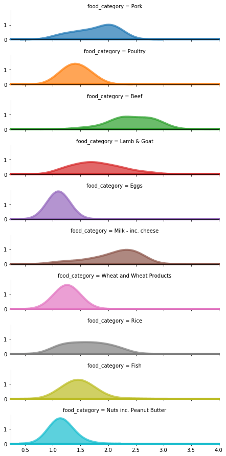
Ridgeline Plot in Python with Seaborn
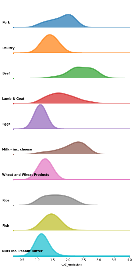
We need to do a few things before it starts looking like a ridgeline plot. We have to remove the title for each plot in the middle, have to remove y-axis line and replace with the group it belongs to. Luckily, Seaborn has a nice example of how to make Ridgeline plot using Seaborn. We will rely on that to make Ridgeline plots in Python with Seaborn.
Let us write small function that labels each subplot nicely and use it with map() function.
def label(x, color, label):
    ax = plt.gca()
    ax.text(-0.1, .2, label, fontweight="bold", color="black",
            ha="left", va="center", transform=ax.transAxes)
Here is the code chunk that removes the y-axis and replaces with group labels. In addition, we also remove title, axis ticks, and use despine to remove the spines from the plot.
ridge_plot = sns.FacetGrid(food_consumption, row="food_category", hue="food_category", aspect=5, height=1.25)
# Draw the densities in a few steps
ridge_plot.map(sns.kdeplot, "co2_emission", clip_on=False, shade=True, alpha=0.7, lw=4, bw=.2)
#g.map(sns.kdeplot, "co2_emission", clip_on=False, color="b", lw=4, bw=.2)
ridge_plot.map(plt.axhline, y=0, lw=4, clip_on=False)
ridge_plot.map(label, "co2_emission")
# Set the subplots to overlap
ridge_plot.fig.subplots_adjust(hspace=-0.01)
# Remove axes details that don't play well with overlap
ridge_plot.set_titles("")
ridge_plot.set(yticks=[])
#ridge_plot.set_xlabel("CO2 Emission",fontsize=30)
ridge_plot.despine(bottom=True, left=True)
ridge_plot.savefig("Ridgeline_plot_Seaborn_Python.png")
Voila, now we get a decent looking ridgeline plot made with Seaborn in Python.
One thing that we need to do is to squish the y-axis so that the density plot from group overlaps slightly with other on top of it. That is for another day! (which basically means I haven’t figured out how to do it 🙂 ).


Thanks for nice tutorial :o)
To overlap the histograms use:
# Set the subplots to overlap
ridge_plot.fig.subplots_adjust(hspace=-.75)
I got it from https://seaborn.pydata.org/examples/kde_ridgeplot
Thanks for the tip.
In the above I used
ridge_plot.fig.subplots_adjust(hspace=-0.01).
For some reason, hspace smaller than -0.01 made the plot look really bad.