Last updated on March 2, 2020
Line plots or time series plots are helpful to understand the trend over time. In this post we will learn how to make multiple line plots (or time-series plots in the sample plot) in R using ggplot2.
Let us load tidyverse the suite of R packages including ggplot2 to make the line plots.
library(tidyverse)
theme_set(theme_bw(base_size=16))
We will use crime data in US over time from the Marshall Project. We load the data from Marshall Project’s github page.
data_url <- "https://raw.githubusercontent.com/themarshallproject/city-crime/master/data/ucr_crime_1975_2015.csv"
crime_data <- read_csv(data_url)
We will be using three of the variables from the data, year and number of violent crimes per 100k of population in different city/town. The city/town information is in “department_name” variable.
crime_data %>%
  select(year, department_name, violent_per_100k) %>%
  head()

## # A tibble: 6 x 3
##    year department_name   violent_per_100k
##   <dbl> <chr>                        <dbl>
## 1  1975 Albuquerque, N.M.             833.
## 2  1975 Arlington, Texas              247.
## 3  1975 Atlanta                      1637.
## 4  1975 Aurora, Colo.                 524.
## 5  1975 Austin, Texas                 404.
## 6  1975 Baltimore                    1862.
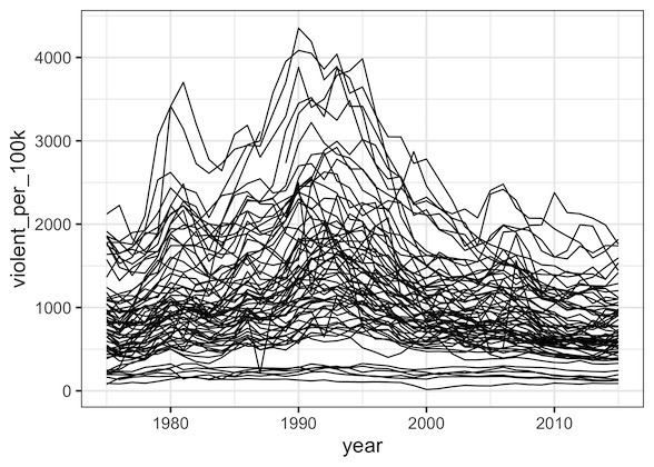
Let us make line plots of violence rate over year for each of the city, i.e. department name. We can make line plot using the geom, geom_line() in ggplot2. In our example, we want year on x-axis and violent_per_100k on y axis for every region (department_name).
Our first instinct make such a line plot is to add the geom_line() layer after specifying x and y variables.
crime_data %>%
  ggplot(aes(x=year, violent_per_100k)) +
  geom_line()
And the resulting plot we got is not what we intended.
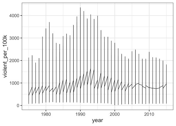
Basically, in our effort to make multiple line plots, we used just two variables; year and violent_per_100k. And we did not specify the grouping variable, i.e. region/department_name information in our data.
crime_data %>%
  ggplot(aes(x=year, violent_per_100k)) +
  geom_line(aes(group=department_name))
After we specify the grouping variable with aes(group=department_name) inside geom_line(), we get a nice multiple line plots with each line showing crime rate over time for each region.