In this post we will learn how to make a time-series plot with a rolling mean using R. Often time-series data fluctuate a lot in short-term and such fluctuations can make it difficult to see the overall pattern in the plot.
A solution is to smooth-out the short term fluctuations by computing rolling mean or moving average over a fixed time interval and plot the smoothed data on top of the original time series data.
Let us load the packages needed, first tidyverse and next zoo package for computing rolling mean.
library(tidyverse)
library(zoo)
theme_set(theme_bw(16))
We will use COVID dataset from COVID tracking project covidtracking.com to see the number of COVID positive tests over time for an US state.
data_url <- "http://covidtracking.com/api/states/daily.csv"
corona <- read_csv(data_url)
Here we convert the date column into a date variable using lubridate’s parse_date_time function.
corona <- corona %>%
  mutate(date=lubridate::parse_date_time(date, "ymd"))
## # A tibble: 6 x 55
##   date                state positive probableCases negative pending
##   <dttm>              <chr>    <dbl>         <dbl>    <dbl>   <dbl>
## 1 2020-11-09 00:00:00 AK       20300            NA   747697      NA
## 2 2020-11-09 00:00:00 AL      204857         31003  1232975      NA
## 3 2020-11-09 00:00:00 AR      122811         11050  1324655      NA
## 4 2020-11-09 00:00:00 AS           0            NA     1768      NA
## 5 2020-11-09 00:00:00 AZ      259699          6698  1630206      NA
## 6 2020-11-09 00:00:00 CA      971851            NA 18946628      NA
## # … with 49 more variables: totalTestResultsSource <chr>,
## #   totalTestResults <dbl>, hospitalizedCurrently <dbl>,
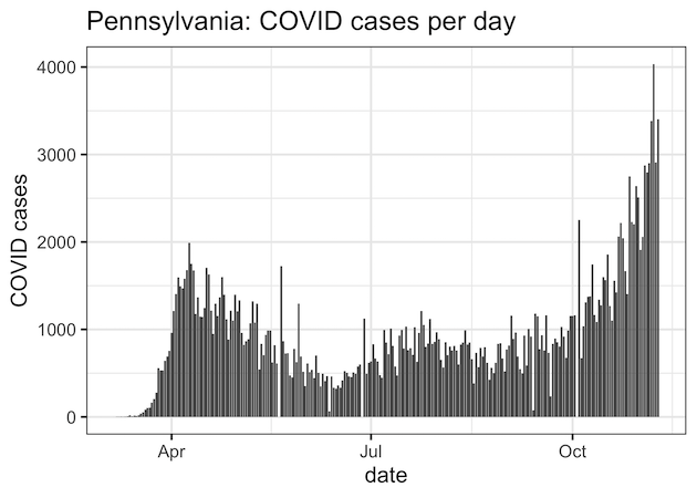
At first, we will make barplot of time series plot of one US state over time.
corona %>%
  filter(state=="PA")%>%
  ggplot(aes(x=date,
             y=positiveIncrease)) +
  geom_col()+
  labs(title="Pennsylvania: COVID cases per day",
       y="COVID cases")
We can see the fluctuations in positive cases per day.
How to Compute Rolling Average in R?
Let us try to make a plot with rolling average. First, let us use the R package zoo to compute rolling average over a week and plot on top of the barplot. With rollmean() function available in zoo package we can compute rolling average. In this example below, we specify the window size to 7 to compute rolling mean. In addition, we also specify the edges in computing the rolling mean. Try changing the “align” argument to see how that affects the rolling mean.
corona %>%
  filter(state=="PA")%>%
  mutate(seven_avg= rollmean(positiveIncrease, 7,
                             align="left",
                             fill=0)) %>%
  relocate(seven_avg) %>%
  head()
For our convenience, we have moved the seven day rolling average to first column in the dataframe. We can see that by aligning to left we have rolling mean values for the first seven rows. With left align and fill =0, we will see that the last values of rolling mean will be zero.
## # A tibble: 6 x 56
##   seven_avg date                state positive probableCases negative pending
##       <dbl> <dttm>              <chr>    <dbl>         <dbl>    <dbl>   <dbl>
## 1     3398  2020-11-10 00:00:00 PA      238657         13507  2470785      NA
## 2     3186. 2020-11-09 00:00:00 PA      234296         12859  2455856      NA
## 3     2994  2020-11-08 00:00:00 PA      230894         12452  2441635      NA
## 4     2851. 2020-11-07 00:00:00 PA      227985         12248  2426121      NA
## 5     2633. 2020-11-06 00:00:00 PA      223950         11692  2408366      NA
## 6     2527. 2020-11-05 00:00:00 PA      220566         11218  2391336      NA
## # … with 49 more variables: totalTestResultsSource <chr>,
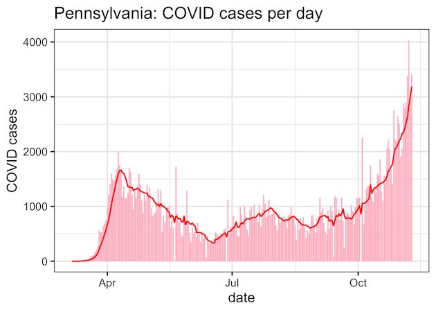
How to Make Time Series plot with Rolling Average in R?
Now we have the rolling average computed and ready to make the time series plot with rolling mean. Basic idea is to make the barplot as before and add geom_line() layer with the rolling mean computed as our y-variable withing aes() inside geom_line() function.
corona %>%
  filter(state=="PA")%>%
  mutate(seven_avg= rollmean(positiveIncrease, 7,
                             align="left",
                             fill=0)) %>%
  ggplot(aes(x=date,
             y=positiveIncrease)) +
  geom_col(fill="pink")+
  geom_line(aes(y = seven_avg),
            color = "red",
            size = .75)+
  labs(title="Pennsylvania: COVID cases per day",
       y="COVID cases")
Now we have the time series plot with rolling mean on top of the barplot. Yes you guessed it right, we have tried to copy NY Times COVID19 plotting style 🙂
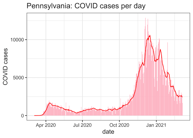
[Updates] The above time series plot with rolling mean was made when the COVID situation was not good. Now that we have vaccines, here is a current and much better looking plot. Hurray to Science!
Another good news is that the same code worked beautifully! Hurray to reproducibility.