Making a boxplot with data points on top of the boxplot is a great way to show distributions of multiple groups. A big advantage is that one can see the raw data and the summary stats of distributions using boxplot with data points.
ggplot2 in R makes it easy to make boxplots and add data points on top of it. However, one typically makes a small mistake while making boxplots with data points in a naive way .
In this post, we will see an example of what that mistake is and then show a way to avoid making the mistake.
Let us first load tidyverse and set ggplot2 theme for making boxplot.
library(tidyverse)
theme_set(theme_bw(16))
We will be using mobile subscription growth data over the years across the work from tidytuesday project.
mobile <- readr::read_csv('https://raw.githubusercontent.com/rfordatascience/tidytuesday/master/data/2020/2020-11-10/mobile.csv')
The mobile growth data contains countries and their mobile subscription over time.
## Parsed with column specification:
## cols(
##   entity = col_character(),
##   code = col_character(),
##   year = col_double(),
##   total_pop = col_double(),
##   gdp_per_cap = col_double(),
##   mobile_subs = col_double(),
##   continent = col_character()
## )
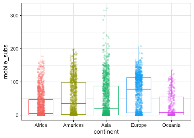
Let us make a boxplot to see the how each continent fared with respect to mobile users. First, we will specify the the variables using aes() function and then add geom_boxplot() to make boxplot. In out example, continent is x-axis and mobile users is on y-axis. We also color the boxplot by continent. To show the data points with jitter, we add geom_jitter().
mobile %>%
  ggplot(aes(x=continent,
             y=mobile_subs,
             color=continent))+
  geom_boxplot()+
  geom_jitter(width=0.1,alpha=0.2)+
  theme(legend.position = "none")
And now we have a nice boxplot with jittered data points on top of it. A small mistake with the plot is that now we have some of the data points plotted twice in our boxplot with jittered data points.
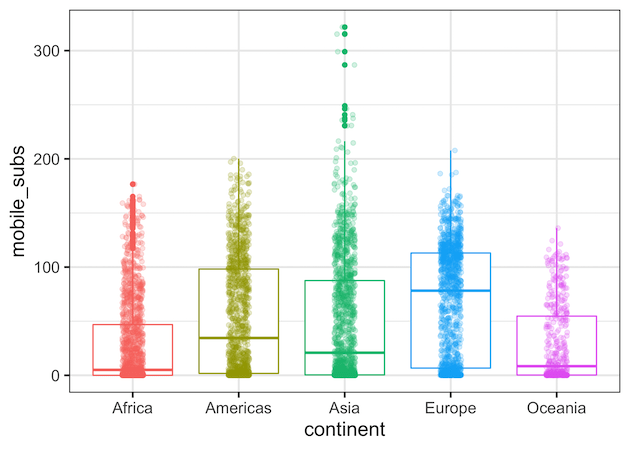
When we make boxplot, geom_boxplot() by default shows the outlier data points. Since we have colored the boxplot by continent, we can easily see that continents Africa and Asia have data points in addition to data points.
mobile %>%
  ggplot(aes(x=continent,
             y=mobile_subs,
             color=continent))+
  geom_boxplot()+
  theme(legend.position = "none")
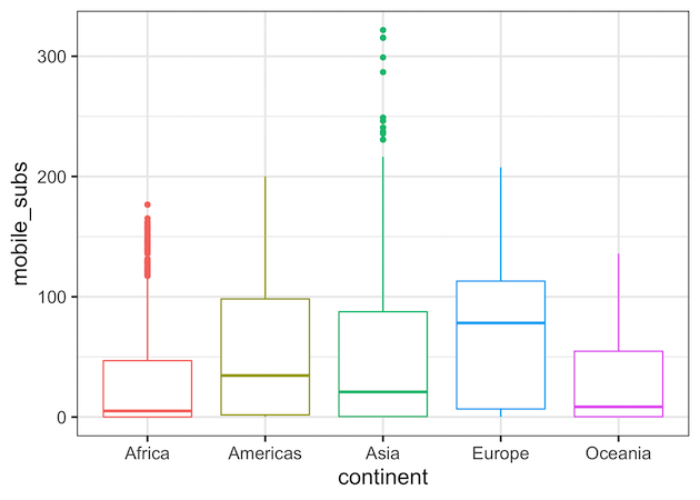
Avoid Double Plotting in Boxplot with outlier.shape in ggplot2
When we add data points on top of boxplot, we plot these outlier data pints twice. And we can see the double plotting in our first boxplot clearly. A solution to avoid this mistake and not plot the outlier data points two times is to use the argument outlier.shape = NA inside geom_boxplot(). This will make boxplot without showing the outlier data points. Now we are not plotting out lier data points twice.
mobile %>%
  ggplot(aes(x=continent,
             y=mobile_subs,
             color=continent))+
  # remove outlier points in boxplot with outlier.shape = NA
  geom_boxplot(outlier.shape = NA)+
  geom_jitter(width=0.1,alpha=0.2)+
  theme(legend.position = "none")
This is a small mistake and may not affect most of the times, however, when you don’t have many data points in your groups, this can become a problem.