
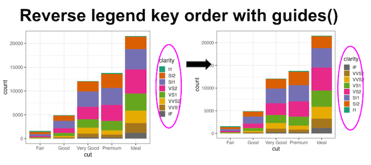
Reversing legend order in ggplot2 is essential for creating intuitive data visualizations where the legend arrangement matches your data hierarchy or presentation needs. By default, ggplot2 displays legend keys in alphabetical order, but often you’ll want to reverse ggplot2 legend order to better align with your data story or visual flow. In this comprehensive ggplot2… Continue reading How to reverse legend key order in ggplot2
Author: datavizpyr
How to Increase Legend Key Size in ggplot2

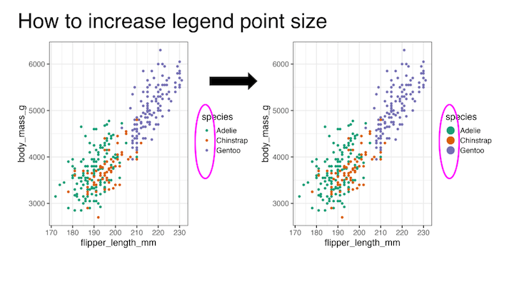
Learning how to increase legend key size in ggplot2 is essential for creating readable and professional data visualizations. When working with scatter plots containing multiple groups or using transparency (alpha), default legend keys can become too small or difficult to distinguish, making it hard for viewers to match colors between the plot and legend. In… Continue reading How to Increase Legend Key Size in ggplot2
Lollipop plot with ggplot extension ggalt

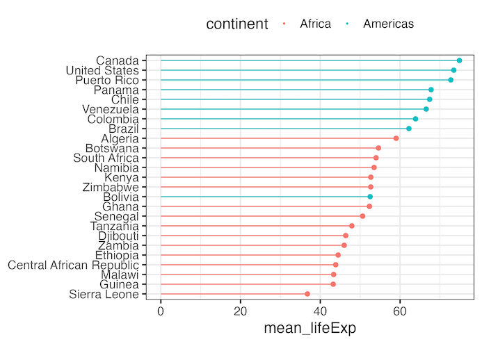
Creating a lollipop plot with ggalt is an excellent way to visualize ranked data with minimal ink usage compared to traditional bar charts. The ggalt package extends ggplot2 functionality with geom_lollipop(), making it easy to create elegant stick-and-circle visualizations that are both space-efficient and visually appealing. In this comprehensive lollipop plot ggalt tutorial, you’ll learn… Continue reading Lollipop plot with ggplot extension ggalt
How to encircle a set of points in R with ggplot2
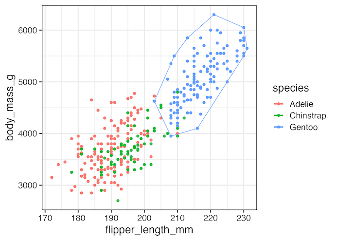
Encircle Data Points in R with geom_encircle() When working with scatter plots in R, it is often helpful to highlight or emphasize groups of data points. The ggalt package provides an elegant solution through the geom_encircle() function. This function automatically draws smooth, freehand-style contours around points, making it easy to highlight categories, clusters, or specific… Continue reading How to encircle a set of points in R with ggplot2
How to Wrap Long Titles in ggplot2 (5 Methods with Examples)
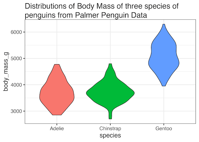
Why Long Titles Get Cut Off in ggplot2 When working with ggplot2 in R, long titles often get truncated or extend beyond the plot area, making your visualization look unpolished. Fortunately, there are multiple ways to break or wrap a long title into multiple lines. In this tutorial, we’ll explore five different methods—from adding newline… Continue reading How to Wrap Long Titles in ggplot2 (5 Methods with Examples)