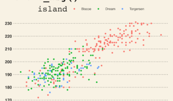
In this post, we will learn how to make beautiful plots with ggplot2 using themes from ggthemes R package. By default ggplot2 makes plots with grey background, using theme_grey(). ggplot2 comes with about 8 complete themes that help us change the look of a given plot. If you … [Read more...] about How to Change ggplot theme with ggthemes
How to make a plot with column name in a variable

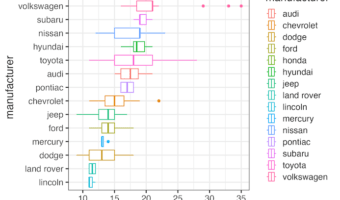
In this tutorial, we will learn how to make a plot using ggplot2 such that the column name of interest in a plot is saved as a variable. And we are interested in using the variable name to make a boxplot. The ability to use a column name as a variable help us make more … [Read more...] about How to make a plot with column name in a variable
Multiple ways to remove legend in ggplot2
Removing legends in ggplot2 is a common requirement when creating clean, professional data visualizations. While legends help identify different groups or categories, there are situations where they become redundant, clutter the plot, or aren't needed for your specific … [Read more...] about Multiple ways to remove legend in ggplot2
Mean and SD plot with Seaborn objects
Creating a mean and SD plot with Seaborn Objects is essential for visualizing statistical summaries and data distribution across different groups in your dataset. The new Seaborn Objects interface (available from Seaborn 0.12.0+) follows grammar of graphics principles, allowing … [Read more...] about Mean and SD plot with Seaborn objects
How to make Stacked area plot with Matplotlib

In this tutorial, we will learn how to make a stacked area plot using Python's Matplotlib. We can make stacked area plot using matplotlib's stackplot() function. The basic syntax of using Matplotlib's stackplot() function is where x(N,) and y(M, N) array-like inputs. Data … [Read more...] about How to make Stacked area plot with Matplotlib