
In this tutorial, we will learn how to duplicate the primary axis in a plot made with ggplot2. We can duplicate either y-axis or x-axis using ggplot2's sec.axis() function. Here we will first see an example of duplication y axis and then an example duplicating x-axis using … [Read more...] about How to duplicate y-axis in ggplot2
How to increase the gap between boxes in a grouped boxplot with Seaborn
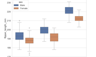
In this post we will learn how to increase the gap between boxes in a nested or grouped boxplot made with Seaborn in Python. We will use Seaborn v0.13.0 that came out in September 2023's feature to increase the gap size. Let us first load the modules/packages needed to make … [Read more...] about How to increase the gap between boxes in a grouped boxplot with Seaborn
Four geoms in ggplot2 to visualize uncertainty
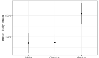
In this post, we will learn about four geoms in ggplot2 that are useful for revealing uncertainty in numerical variables with multiple categories. The four geoms, geom_errorbar(), geom_linerange(), geom_crossbar(), and geom_pointrange() are useful when we have categeorical x … [Read more...] about Four geoms in ggplot2 to visualize uncertainty
How to make legend order match with plot
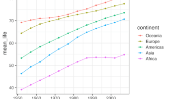
In this post we will learn how to make a line plot such that data on the plot matches with the legend order. We will use forcats package's fct_reorder2() function. Let us load the packages needed. We will use gapminder data set to make a line plot. First let us … [Read more...] about How to make legend order match with plot
How to make boxplots between one categorical variable vs all numerical variables
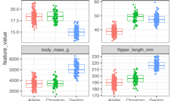
Often one might be interested in quickly visualizing the relationship between one categorical vs all numerical variables in a dataframe. We can make multiple boxplots between one categorical variable against all the numerical variables on the dataframe at the same time. In … [Read more...] about How to make boxplots between one categorical variable vs all numerical variables