
In this tutorial, we will learn how to write a function to make a histograms using ggplot2 in R. Writing a function to create plots is useful, when you make a lot of plots, in this example, a lot of histograms. Thanks to the upcoming 2nd edition of R for Data Science by … [Read more...] about How to write a function make histograms with ggplot
Remove or Hide Legends in ggplot2 – Theme, Guides, Scales & Tips
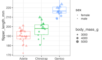
Legends in ggplot2 are powerful but can sometimes clutter your visualization. In this tutorial using ggplot2 in R, we’ll walk step by step through methods to hide all legends, remove specific ones like color or shape, control them at the layer level, and even tidy them with scale … [Read more...] about Remove or Hide Legends in ggplot2 – Theme, Guides, Scales & Tips
How to Visualize Missing Values in a dataframe as heatmap
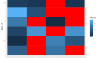
In this post, we will learn how to visualize a dataframe with missing values represented as NAs as a heatmap. A quick visualization of missing values in the data is useful in analyzing the data. We will use mainly tidyverse approach, first to create a toy dataframe with missing … [Read more...] about How to Visualize Missing Values in a dataframe as heatmap
Histogram Tutorial with Seaborn Grammar of Graphics API
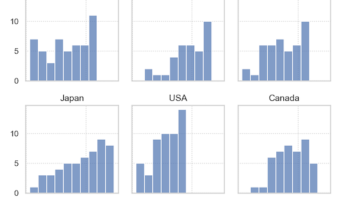
Seaborn, one of the Python data visualisation libraries had a huge update with Seaborn version 0.12.0 in September 2022. A really exciting development is new API for grammar of graphics like ggplot2. The introduction of seaborn.objects interface is the new API Taking … [Read more...] about Histogram Tutorial with Seaborn Grammar of Graphics API
How to add color to axis tick labels: Hint – element_markdown() in ggtext

In this tutorial, we will learn about a nice ggplot2 trick/tip that enables colored text on axis tick labels. Thanks to new theme element element_markdown() in ggtext, R package developed by Claus Wilke, we can add colors to axis text labels. To get started, let us load the … [Read more...] about How to add color to axis tick labels: Hint – element_markdown() in ggtext