Histograms are of great use to visualize a uni-variate distribution. As ggplot2 defines, histograms “Visualise the distribution of a single continuous variable by dividing the x axis into bins and counting the number of observations in each bin.” ggplot2’s geom_histogram() function displays the counts as bars and it also makes it easy to customize histograms easily.
In this post we will see 5 tips to make a histogram and customize to make it better.
Let us load the packages needed. We will be using gapminder data to make histograms.
library(tidyverse)
library(gapminder)
theme_set(theme_bw(base_size=16))
In this example, we use gapminder data from gapminder library.
head(gapminder)

## # A tibble: 6 x 6
##   country     continent  year lifeExp      pop gdpPercap
##   <fct>       <fct>     <int>   <dbl>    <int>     <dbl>
## 1 Afghanistan Asia       1952    28.8  8425333      779.
## 2 Afghanistan Asia       1957    30.3  9240934      821.
## 3 Afghanistan Asia       1962    32.0 10267083      853.
## 4 Afghanistan Asia       1967    34.0 11537966      836.
## 5 Afghanistan Asia       1972    36.1 13079460      740.
## 6 Afghanistan Asia       1977    38.4 14880372      786.
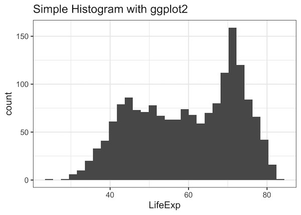
Let us make our first histogram. We use histogram to visualize the distribution of lifeExp variable from gapminder.
Simple Histogram with ggplot2
In ggplot2, geom_histogram() function makes histogram. We first provide the variable name to the aesthetics function in ggplot2 and then add geom_histogram() as another layer to make histogram. In this example, we also add title and x-axis label using labs() function.
gapminder %>%
  ggplot(aes(x=lifeExp))+
  geom_histogram() +
  labs(title="Simple Histogram with ggplot2",
         x= "LifeExp")
1. How To Change the number of bins in Histogram with ggplot2?
One of the key parameters of histogram is the number of bins. By default, when you make a histogram ggplot2 uses 30 bins and gives you a warning about the number of bins.
We can specify the number of bins you want using bins argument inside geom_histogram(). In this example we use bins=100.
gapminder %>%
  ggplot(aes(x=lifeExp))+
  geom_histogram(bins=100) +
  labs(title="Histogram with color",
         x= "LifeExp")
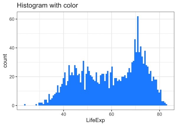
2. How to Change Histogram Color with ggplot2?
By default, ggplot fills the bars in histogram with grey color. We can manually change the fill color using fill argument inside geom_histogram. In this example, we have bill=”dodgerblue” to make histogram in blue color.
gapminder %>%
  ggplot(aes(x=lifeExp))+
  geom_histogram(bins=100, fill="dodgerblue") +
  labs(title="Histogram with color",
         x= "LifeExp")
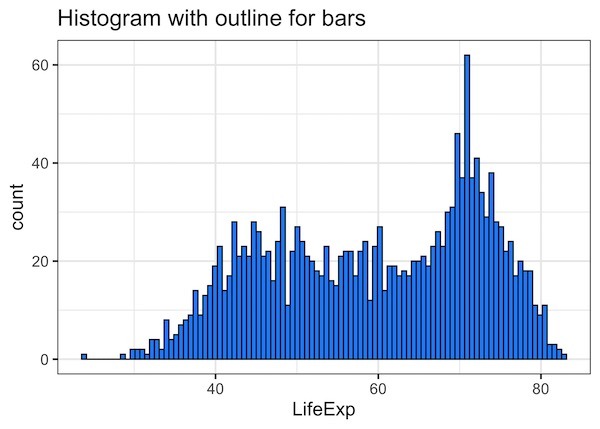
3. How to Add outline to Histogram’s bars?
If you look at the bars in histogram there is no outline and it makes the histogram look like continuous. Adding out line with different color can make the bars in histogram prominent. To add outline in different color, we specify color argument inside geom_histogram() function.
gapminder %>%
  ggplot(aes(x=lifeExp))+
  geom_histogram(bins=100,
                 color="black",
                 fill="dodgerblue") +
  labs(title="Histogram with outline for bars",
         x= "LifeExp")
In this example, we have black outline bars filled with dodgerblue color.
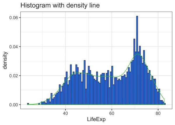
4. How to Add Density Line to a Histogram in ggplot2?
Adding density line to histogram can help us identify the pattern in histogram easily. We can add density line to a histogram by adding another geom_() function; geom_density(). This will convert the frequency histogram into density histogram and add the density line to it.
gapminder %>%
  ggplot(aes(x=lifeExp))+
  geom_histogram(aes(y =..density..),
                 bins=100,
                 color="black",
                 fill="dodgerblue") +
  labs(title="Simple Histogram with density line",
         x= "LifeExp")+
  geom_density(col=3)
In this example we have added density lien with geom_density() function and specify the color of line as an argument to it.
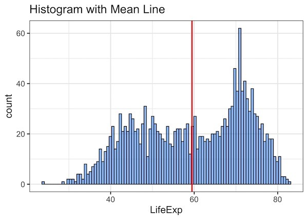
5. How to Add Mean Vertical Line to a Histogram in ggplot2?
Another useful addition to a histogram is to annotate the histogram with vertical line describing the central tendency of the histogram. For example, we can add a vertical line for median or mean value of the distribution.
We can a vertical line in ggplot with the geom_() function geom_vline(). In this example, we add a line at mean value of lifeExp in red color.
gapminder %>%
  ggplot(aes(x=lifeExp))+
  geom_histogram(bins=100,
                 color="black",
                 fill="dodgerblue",
                 alpha=0.5) +
  geom_vline(aes(xintercept=mean(lifeExp)),
            color="red",  size=1)+
  labs(title="Histogram with Vertical Line",
         x= "LifeExp")