
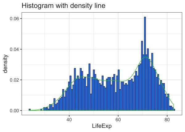
Histograms are of great use to visualize a uni-variate distribution. As ggplot2 defines, histograms “Visualise the distribution of a single continuous variable by dividing the x axis into bins and counting the number of observations in each bin.” ggplot2’s geom_histogram() function displays the counts as bars and it also makes it easy to customize histograms… Continue reading 5 tips to make better histograms with ggplot2 in R