Adding right colors to the plots greatly help convey the main message of the plot. Adding colors manually can be a bit challenging. Color palettes available from RColorBrewer package make it easy add right set of colors to plots made with ggplo2.
In this tutorial, we will see examples of adding colors to Boxplots using color palettes available from RColorBrewer.
Let us load tidyverse and RColorbrewer package.
library(tidyverse)
library(RColorBrewer)
theme_set(theme_bw(base_size = 16))
We will use the fast food data from tidytuesday project.
data_url <-"https://raw.githubusercontent.com/rfordatascience/tidytuesday/master/data/2018/2018-09-04/fastfood_calories.csv"
fast_food <- read_csv(data_url)
Let us select just two variables; fast food restaurant and amount of cholesterol in their food products. We will also use forcats’ fct_reorder to level the factors by cholesterol values.
fast_food <- fast_food %>%
  mutate(restaurant=fct_reorder(restaurant, cholesterol)) %>%
  select(restaurant,cholesterol)
This is how our fast food data looks like.
head(fast_food)

## # A tibble: 6 x 2
##   restaurant cholesterol
##   <fct>            <dbl>
## 1 Mcdonalds           95
## 2 Mcdonalds          130
## 3 Mcdonalds          220
## 4 Mcdonalds          155
## 5 Mcdonalds          120
## 6 Mcdonalds           80
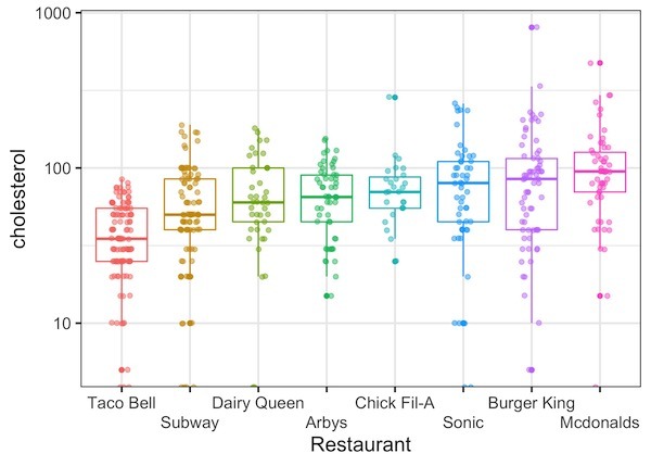
Let us first make simple boxplot and color the boxes uses restaurant. ggplot2 automatically chooses the colors for us and colors the boxplot with jitter. Here we also make sure x-axis label text do not overlap using ggplot2 v2.3.0’s guide_axis() function
fast_food %>%
  ggplot(aes(x=restaurant, y=cholesterol, color=restaurant)) +
  geom_boxplot()+
  geom_jitter(width=0.15, alpha=0.5)+
  scale_y_log10()+
  labs(x="Restaurant") +
  scale_x_discrete(guide = guide_axis(n.dodge=2))+
  theme(legend.position="none")
ggsave("Coloring_Boxplots_with_ggplot2.jpg")
Coloring Boxplots with ggplot2’s scale_fill_brewer() using RColorBrewer
The colors on boxplot look good. However, sometime you might want to use color palettes available from RColorbrewer package. ggplot2 has two functions available for using color palettes in ggplot2, one is scale_fill_brewer() and scale_color_brewer().
scale_fill_brewer() function is useful when you want to use color palette from RColorBrewer and fill boxplots with colors color palette.
Here we have used Orange and Red color palette using ‘palette=”OrRd”‘ inside scale_fill_brewer(). Check out this post to learn more about the available color palettes in RColorBrewer.
fast_food %>%
  ggplot(aes(x=restaurant, y=cholesterol, fill=restaurant)) +
  geom_boxplot()+
  geom_jitter(width=0.15, alpha=0.5)+
  scale_y_log10()+
  labs(x="Restaurant") +
  theme(legend.position="none")+
  scale_x_discrete(guide = guide_axis(n.dodge=2))+
  scale_fill_brewer(palette="OrRd")
ggsave("Coloring_Boxplots_with_RColorBrewer_palette_OrRd_ggplot2.jpg")

Coloring Boxplots with ggplot2’s scale_color_brewer() using RColorBrewer
scale_color_brewer() function is useful when you want to use color palette from RColorBrewer and just color boxplots using specific color palette.
Here we have used Paired color palette that uses pair of colors using palette=”Paired” inside scale_color_brewer()
fast_food %>%
  mutate(restaurant=fct_reorder(restaurant, cholesterol)) %>%
  ggplot(aes(x=restaurant, y=cholesterol, color=restaurant)) +
  geom_boxplot()+
  geom_jitter(width=0.15, alpha=0.5)+
  scale_y_log10()+
  labs(x="Restaurant") +
  theme(legend.position="none")+
  scale_x_discrete(guide = guide_axis(n.dodge=2))+
  scale_color_brewer(palette="Paired")