

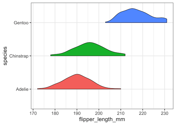
Raincloud plot is another interesting use of Violinplots. Rain cloud plot is basically a combination of horizontal half violin plots with jittered data points. We will see step-by-step examples of how to make raincloud plot in this tutorial in R with ggplot2. Since there is no special function available for half violinplot in ggplot2, we… Continue reading Rain Cloud Plots using Half Violin Plot with jittered data points in R
Category: R
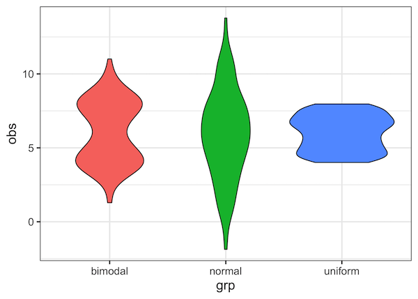
How To Make Half Violinplot with ggplot2 in R?

Violinplots are a great alternative to boxplot to visualize distribution of multiple variables. In this turtorial, we will learn about, half violin plot, a variant of violinplot in R with ggplot2. It is literally half of a violinplot, in a meaningful way. We will see examples of how to make half violinplot using ggplot2. For… Continue reading How To Make Half Violinplot with ggplot2 in R?
How To Make Violinplot with Data Points in R?
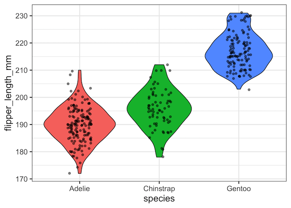
Violinplots are a great alternative to boxplot, as it combines boxplot and density plot. In this tutorial, we will see examples of how to make violinplots with using ggplot2’s geom_violin() function. Violinplots are like boxplot for visualizing numerical distributions for multiple groups. In comparison to boxplot, Violin plot adds information about density of distributions to… Continue reading How To Make Violinplot with Data Points in R?
How To Remove facet_wrap Title Box in ggplot2?

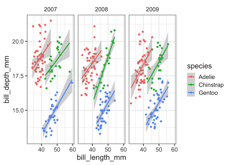
In this tutorial, we will see how to remove box surrounding title of each facets made with facet_wrap() function in ggplot2. Let us load tidyverse and set ggplot2 theme_bw() with base size 16. Let us use Palmer penguin dataset to make plots with facets using facet_wrap() in ggplot2. We ill use the palmerpenguins package to… Continue reading How To Remove facet_wrap Title Box in ggplot2?
Violinplot vs Boxplot: Why Violinplot Is Better Than Boxplot
Violinplot or boxplot? What is better? Boxplots is great visualization to show a numerical variable. A boxplot shows “four main features about a variable: center, spread, asymmetry, and outliers”. With the five summary statistics one can easily draw boxplot even by hand. Violin plots are very similar to boxplot. In addition to the four main… Continue reading Violinplot vs Boxplot: Why Violinplot Is Better Than Boxplot