
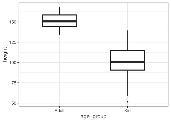
A boxplot is one of the simplest ways to summarize and visualize a distribution. Boxplots have been around for close to 50 years. The earliest form of Boxplot was invented by Mary Eleanor Spear as range plot and then John Tukey created box-and-whisker plot that uses quartiles of a distribution draw a box and whiskers.… Continue reading How to Make Boxplots with ggplot2 in R?
Tag: R
How To Change Axis Label, Set Title and Subtitle in ggplot2

One of the key ingredients of a good plot is providing enough information on the plot to help convey the message in the plot. In this post we will examples of how to change x-axis and y-axis labels in a plot made with ggplot2 in R. And then we will see how to change axis… Continue reading How To Change Axis Label, Set Title and Subtitle in ggplot2
How To Change Axis Font Size with ggplot2 in R?
A plot or graphics made without legible x-axis and y-axis labels is a worthless plot. ggplot2 in R makes it easy to change the font size of axis labels. In this post, we will see examples of how to increase the font size of x and y-axis labels in R, including the tick mark labels… Continue reading How To Change Axis Font Size with ggplot2 in R?
How To Change ggplot2 theme?

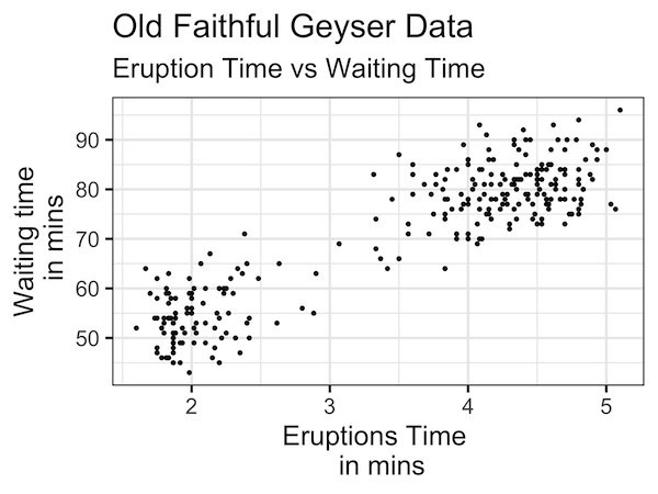
ggplot2 offers 8 themes for making plots using ggplot2. By default, ggplot2 uses the grey theme. Here, we will examples of how to change the plot theme from the default grey ggplot2 theme. Let us first make a simple scatter plot with default grey ggplot theme Let us create data frame with two variables to… Continue reading How To Change ggplot2 theme?
Scatter Plot with Transparent Points Using ggplot2 in R
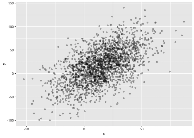
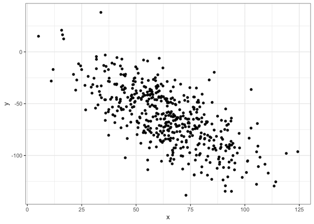
While scatter plots are ideal for visualizing the relationship between two quantitative variables, their effectiveness diminishes with large datasets due to overplotting. This issue occurs when numerous data points are plotted on top of each other, hiding the true density of the data. To solve this, we can make the points transparent. In this tutorial,… Continue reading Scatter Plot with Transparent Points Using ggplot2 in R