
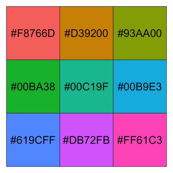
ggplot2 adds colors to its plot automatically. Sometimes you might want to get the list of colors (color codes) that ggplot2 uses. In this post, we will learn how to get the color codes that ggplot2 uses by default in a plot. We will use scales package in tidyverse to get the colors for different… Continue reading How To Get the Default Color Codes of ggplot2?
How To Manually Specify Colors for Barplot in ggplot2?

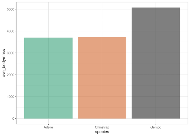
One of the great things about making plots with ggplot2 is that it offers a number of ways to add colors to the plots. We can use ggplot2’s default options for adding colors to plots. However, sometimes one might want to manually specify colors to a plot. There are a few ways to manually specify… Continue reading How To Manually Specify Colors for Barplot in ggplot2?
How To Make Scatterplot with Marginal Histograms in R?

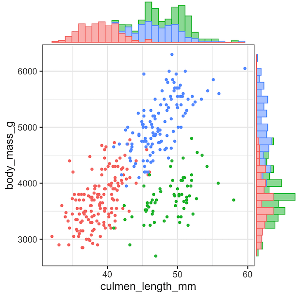
In this post, we will learn how to make a scatterplot with marginal histograms in R. We will use ggExtra, one of the ggplot2 extension packages to make scatterplot with marginal histogram. First, we will add simple marginal histograms to a scatterplot made with ggplot2. Next, we we will show how to color the histogram… Continue reading How To Make Scatterplot with Marginal Histograms in R?
How to Make Scatterplot with Marginal Density Plots with Seaborn
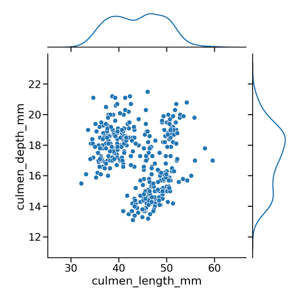
In this tutorial, we will use Seaborn and learn how to make a scatterplot between two quantitative variables with marginal density plots on the sides. We will use Seaborn’s JointGrid() to define the features of the plot and then add scatter plot on top first and then add marginal density plots as marginal. This strategy… Continue reading How to Make Scatterplot with Marginal Density Plots with Seaborn
A mistake to Avoid while making boxplot with datapoints in ggplot2

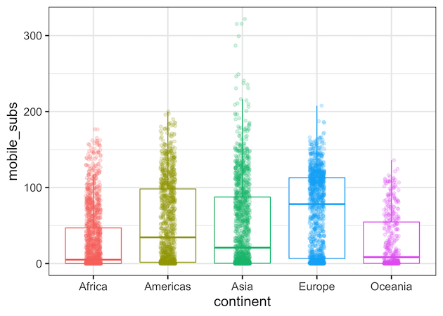
Making a boxplot with data points on top of the boxplot is a great way to show distributions of multiple groups. A big advantage is that one can see the raw data and the summary stats of distributions using boxplot with data points. ggplot2 in R makes it easy to make boxplots and add data… Continue reading A mistake to Avoid while making boxplot with datapoints in ggplot2