Creating maps is one of the most powerful ways to visualize data, and R’s ggplot2 package makes it surprisingly straightforward.
In this tutorial, you’ll learn how to build beautiful and informative US maps from the ground up. We’ll guide you step-by-step through creating both state-level and detailed county-level maps. Then we will see how to overlay data of interest on to the map.
To bring it all together, we’ll walk through a real-world example: mapping MMR vaccination rates across the United States.
Let us get started with load the tidyverse suite of R packages.
library(tidyverse)
theme_set(theme_bw(base_size=16))
To make US maps, we need map data at the level of states and counties. When we loaded tidyverse, we also got some basic map data at state and county levels. Let us load state and county level data
us_states <- map_data("state")
us_counties <- map_data("county")
head(us_states)
##        long      lat group order  region subregion
## 1 -87.46201 30.38968     1     1 alabama      <NA>
## 2 -87.48493 30.37249     1     2 alabama      <NA>
## 3 -87.52503 30.37249     1     3 alabama      <NA>
## 4 -87.53076 30.33239     1     4 alabama      <NA>
## 5 -87.57087 30.32665     1     5 alabama      <NA>
## 6 -87.58806 30.32665     1     6 alabama      <NA>
How To Make US State level Map with ggplot2?
Let us make simple US state level map with map data we have using ggplot2. We first provide the aesthetics with longitude and latitude as x and y. We also need to specify group argument to specify the state level information. Here we also fill by state.
p <- ggplot(data = us_states,
            mapping = aes(x = long, y = lat,
                          group = group, fill = region))
This sets us up with aesthetics for the map, but we have not added the geom for map. In ggplot2, we can use geom_polygon() to create map using the aesthetics. Since we don’t want state names as legend, we use guides(fill = FALSE) to remove the legends.
p + geom_polygon() +
    guides(fill = FALSE)
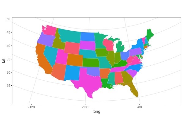
We get a simple map made with ggplot2. If you look closely, the projection is not good and looks slightly distorted.
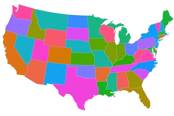
There are multiple projections we can choose. Here we use one of the commonly used projection called, “albers” projection .

p + geom_polygon(color = "gray90", size = 0.1) +
    coord_map(projection = "albers", lat0 = 39, lat1 = 45) +
    guides(fill = FALSE)
Now our first attempt at making US state level map look much better.
The simple map has longitude and latitude on its axes. Let us remove the axes and other unnecessary aspects of the plot to just keep the map alone using various options in theme() layer.
p + geom_polygon(color = "gray90", size = 0.1) +
    coord_map(projection = "albers", lat0 = 39, lat1 = 45) +
    guides(fill = FALSE)+
    theme(axis.line=element_blank(),
              axis.text=element_blank(),
              axis.ticks=element_blank(),
              axis.title=element_blank(),
        panel.background=element_blank(),
              panel.border=element_blank(),
              panel.grid=element_blank())
Our state level US map has no axes and no background as we needed.

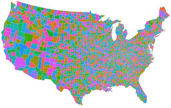
How To Make US County Level level Map with ggplot2?
While state maps provide a great overview, sometimes your data story requires a more detailed, county-level perspective. Building on the concepts we just covered, the process for creating a county map is remarkably similar. Let’s walk through how to render these more granular boundaries using ggplot2.
us_counties data contains county level information we can use.
head(us_counties)

##        long      lat group order  region subregion
## 1 -86.50517 32.34920     1     1 alabama   autauga
## 2 -86.53382 32.35493     1     2 alabama   autauga
## 3 -86.54527 32.36639     1     3 alabama   autauga
## 4 -86.55673 32.37785     1     4 alabama   autauga
## 5 -86.57966 32.38357     1     5 alabama   autauga
## 6 -86.59111 32.37785     1     6 alabama   autauga
Let us use ggplot2 with aesthetics just like the way we made state level map. Now we use county level information to define the borders.
p <- ggplot(data = us_counties,
            mapping = aes(x = long, y = lat,
                          group = group, fill = subregion))
To make the right kind of US map we use “albers” projection and remove any background and axes information using theme as before.
p + geom_polygon(color = "gray90", size = 0.1) +
  coord_map(projection = "albers", lat0 = 39, lat1 = 45) +
  guides(fill = FALSE)+
  theme(axis.line=element_blank(),
        axis.text=element_blank(),
        axis.ticks=element_blank(),
        axis.title=element_blank(),
        panel.background=element_blank(),
        panel.border=element_blank(),
        panel.grid=element_blank())
Now we get a nice county level US map as we needed.

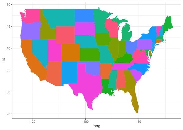
How To Overlay Data on US State Level Map with ggplot2?
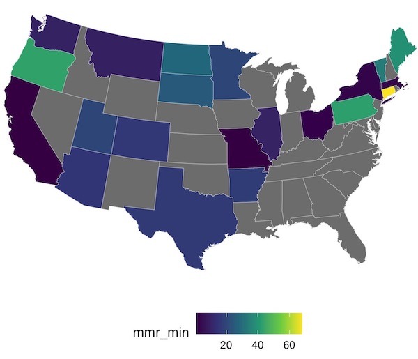
To summarize so far, we saw how to make simple maps using ggplot2. Often it is more useful to make maps with overlaying data of your interest on it. Now we will see example of visualizing some data on the map. We will use MMR vaccination level across US schools from tidytuesday project.
Let us load the measles data from TidyTuesday’s github.
measles <- readr::read_csv('https://raw.githubusercontent.com/rfordatascience/tidytuesday/master/data/2020/2020-02-25/measles.csv')
This contains school level vaccination data for a couple of years. Let us summarize the data to state level median MMR vaccination rate and overlay on state level map.
measles_state <- measles %>%
  filter(mmr >=0) %>%
  mutate(state=tolower(state)) %>%
  group_by(state) %>%
  summarize(mmr_min= min(mmr,na.rm=TRUE),
            mmr_median= median(mmr,na.rm=TRUE))
Our summarized data looks like this, where for each state we have minimum and median MMR vaccination rate.
measles_state %>% head()

## # A tibble: 21 x 3
##    state         mmr_min mmr_median
##    <chr>           <dbl>      <dbl>
##  1 arizona          15.4       95
##  2 arkansas         17.2       82.3
##  3 california        1         98
##  4 colorado         16.2       97.8
We will combine the above state level vaccination data with state level map data
us_states %>%
  left_join(measles_state, by=c("region"="state"))
And then we can use the code chunk for making state level map as before. Now will use median MMR rate to fill the colors.
us_states %>%
  left_join(measles_state, by=c("region"="state")) %>%
  ggplot(aes(x=long,y=lat,group=group, fill=mmr_min)) +
  geom_polygon(color = "gray90", size = 0.1) +
  #coord_map(projection = "albers", lat0 = 39, lat1 = 45) +
  coord_map(projection = "albers", lat0 = 45, lat1 = 55) +
  scale_fill_continuous(type = "viridis")+
  #scale_fill_brewer("Oranges")+
  theme(legend.position="bottom",
        axis.line=element_blank(),
        axis.text=element_blank(),
        axis.ticks=element_blank(),
        axis.title=element_blank(),
        panel.background=element_blank(),
        panel.border=element_blank(),
        panel.grid=element_blank())
Now we have a state level US map with colors filled on states representing the minimum MMR vaccination rate in the state. Grey color states are states without MMR vaccination data.
Explore the Complete ggplot2 Guide
35+ tutorials with code: scatterplots, boxplots, themes, annotations, facets, and more—tested and beginner-friendly.
Visit the ggplot2 Hub → No fluff—just code and visuals.