
When you have dataset with two categorical variables and one quantitative variable, a grouped barplot is a great way to see the relationship among the variable. In a simple barplot, we have categorical variable on x-axis and have bars showing the numerical value of the quantitative variable. In a grouped barplot, we add the third variable by splitting the bar.
In this tutorial, we will see two examples of making grouped barplot using geom_col() in ggplot2. At first we will make barplot with grouping variable vertically stacked. Next we will see how to make a grouped barplot, where the bars within each group are side by side.
Let us load the packages needed. We will use Palmer Penguins dataset to make grouped barplots in R with ggplot2.
library(tidyverse)
library(palmerpenguins)
theme_set(theme_bw(base_size=16))
First, let us compute the summarised data from Penguin data. We use group_by() and summarise() functions to compute average body mass for each sex in each species.
df <- penguins %>%
  drop_na()%>%
  group_by(species, sex) %>%
  summarize(avg_body_mass=mean(body_mass_g))
Our data for plotting grouped barplot looks like this. We have two categorical variables and one numerical variable.
df

## # A tibble: 6 x 3
## # Groups:   species [3]
##   species   sex    avg_body_mass
##   <fct>     <fct>          <dbl>
## 1 Adelie    female         3369.
## 2 Adelie    male           4043.
## 3 Chinstrap female         3527.
## 4 Chinstrap male           3939.
## 5 Gentoo    female         4680.
## 6 Gentoo    male           5485.
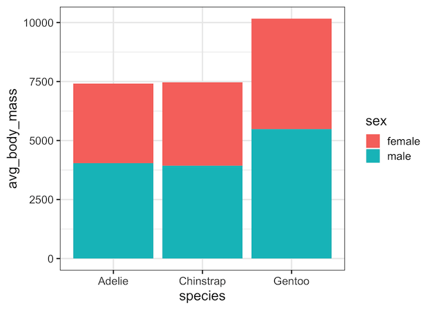
Vertically Stacked Barplot in R
Let us make a grouped barplot using geom_col(). Here we use species variable on x-axis and average body mass on y-axis. We use the third variable sex to fill argument.
df %>%
  ggplot(aes(x=species,y=avg_body_mass, fill=sex))+
  geom_col()
ggsave("grouped_barplot_vertically_stacked.png")
And this makes vertically stacked barplot with different colors for different values of the third variable.
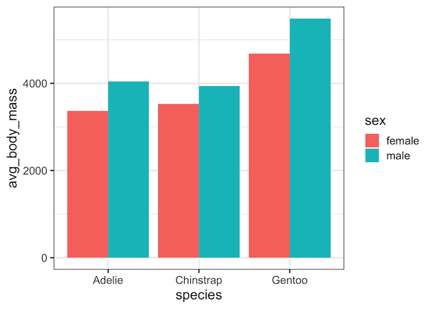
How to Grouped Barplot with bars side by side? Hint: use position=”dodge”
Although vertically stacked barplot can be useful, often it can be harder to interpret. We may not be able to see the subtle difference in barheights among the different groups. A better alternative is to make the grouped barplot side by side and since the bars start at y=0, we can easily compare the heights of bars from different groups. In ggplot2, default barplot we get with fill argument for third variable is vertically stacked barplot.
To make the barplot with bars side by side, we use “position” argument to geom_col() function and specify position=”dodge” as shown in the example below
df %>%
  ggplot(aes(x=species,y=avg_body_mass, fill=sex))+
  geom_col(position="dodge")
ggsave("grouped_barplot_side_by_side.png")
Now we get grouped barplot with bars side by side.
Explore the Complete ggplot2 Guide
35+ tutorials with code: scatterplots, boxplots, themes, annotations, facets, and more—tested and beginner-friendly.
Visit the ggplot2 Hub → No fluff—just code and visuals.


