
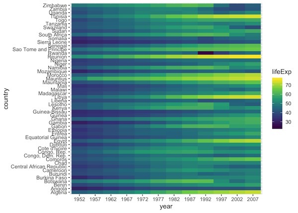
Heatmaps are data visualization tool that displays a matrix of data as a matrix of colors. For example, matrix elements with low values will have lighter colors and the elelments with high values will have a darker color. In earlier post we saw examples of making heatmap using ggplot2 in R. However, we assumed that… Continue reading Heatmap from Matrix using ggplot2 in R
Category: R
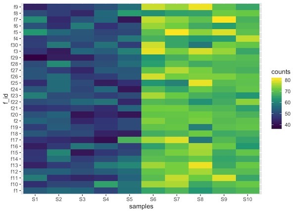
How To Make Simple Heatmaps with ggplot2 in R?
Heatmaps are a powerful way to visualize multi-dimensional data. By representing numerical values as colors within a matrix, heatmaps allow us to spot patterns, clusters, and outliers instantly. For example, you might visualize high values in a dark color and low values in a light color, making data trends immediately apparent to the human eye.… Continue reading How To Make Simple Heatmaps with ggplot2 in R?
How To Make Boxplots with Data Points in R using ggplot2?
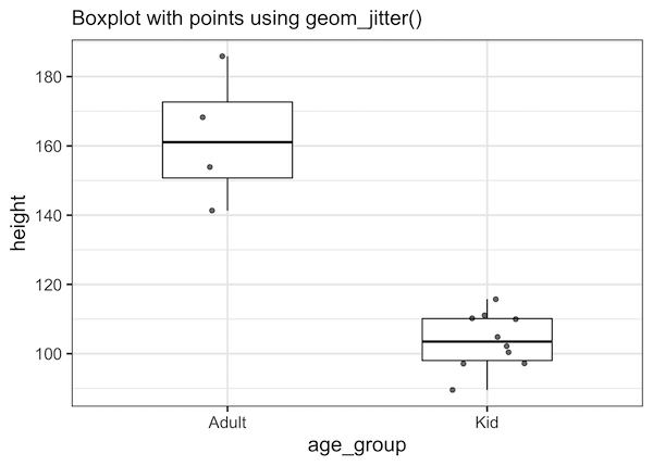
Boxplots with data points are a great way to visualize multiple distributions at the same time without losing any information about the data. In this tutorial, we will see examples of making Boxplots with data points using ggplot2 in R and customize the boxplots with data points. Let us load all the packages in tidyverse… Continue reading How To Make Boxplots with Data Points in R using ggplot2?
How to Reorder bars in barplot with ggplot2 in R
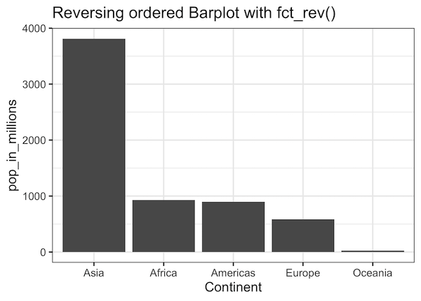
In this post, we will learn how to order bars in a barplot using ggplot2 in R. When we make barplot with ggplot2 on a character variable it places the group in alphabetical order. Here we will learn to use two functions, reorder() from base R and fct_reorder() function from forcats package to order the… Continue reading How to Reorder bars in barplot with ggplot2 in R
How To Make Barplots with ggplot2 in R?
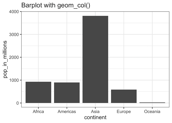
Barplots are a popular graphics that is widely used to show categorical data with retangular bars whose height represent the quantitative value the variable. In this post we will see multiple examples of making bar plots using ggplot2 in R. Let us first load tidyverse, a suite of R packages including ggplot2. We will use… Continue reading How To Make Barplots with ggplot2 in R?