
In this tutorial, we will learn how to make a donut plot in R using ggplot2. Donut plot is nothing but a bar plot, reshaped into pie-chart, and then adding a hole at the center to make it look like a donut. We will learn these in step by step manner to understand making Donut … [Read more...] about How to make Donut plot with ggplot2
R
How to change axis tick label size in ggplot2

Are your ggplot2 axis tick labels too small to read in presentations, reports, or publications? Don’t worry—you’re not alone. In this step-by-step tutorial, you’ll learn how to change axis tick label size in ggplot2 using theme(), element_text(), and other customization options. … [Read more...] about How to change axis tick label size in ggplot2
How to make rolling mean line plot of stock data
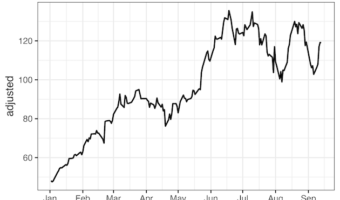
Want to smooth out erratic stock price fluctuations and spot the underlying trend? In this tutorial, you’ll learn how to compute and visualize a rolling mean (moving average) of stock prices in R using tidyquant, zoo package's rollmean(), and ggplot2. We’ll fetch Nvidia (NVDA) … [Read more...] about How to make rolling mean line plot of stock data
How to add P-value to each facet in ggplot2
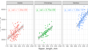
This tutorial shows you how to add p-value to each facet in ggplot2 when creating multi-panel plots in R. Using a scatter plot example, we’ll perform linear regression analysis for each facet to determine statistical significance. And then we will display the corresponding … [Read more...] about How to add P-value to each facet in ggplot2
How to Annotate Positive and Negative Values in a barplot

In this post, we will learn how to properly annotate a bars barplot, where there are both positive and negative values/bars in ggplot2. In ggplot2, we can use gem_text() with label option to annotate text or bar heights on a barplot easily. However, when we have a barplot that … [Read more...] about How to Annotate Positive and Negative Values in a barplot