
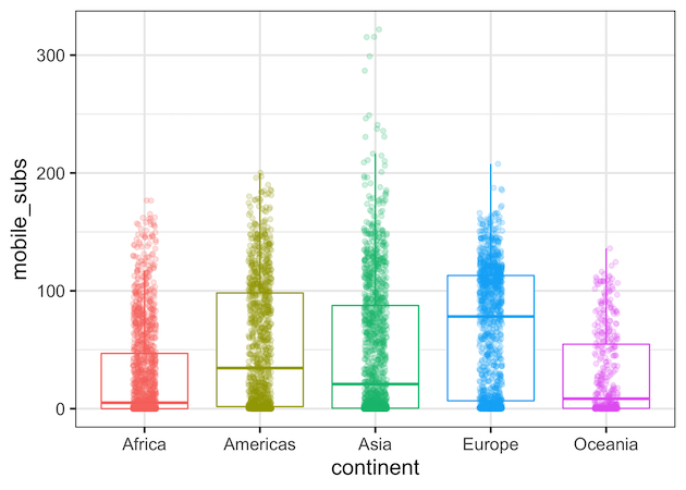
Making a boxplot with data points on top of the boxplot is a great way to show distributions of multiple groups. A big advantage is that one can see the raw data and the summary stats of distributions using boxplot with data points. ggplot2 in R makes it easy to make boxplots and add data… Continue reading A mistake to Avoid while making boxplot with datapoints in ggplot2
Category: R
How to Make Time-Series Plot with Rolling Mean in R?
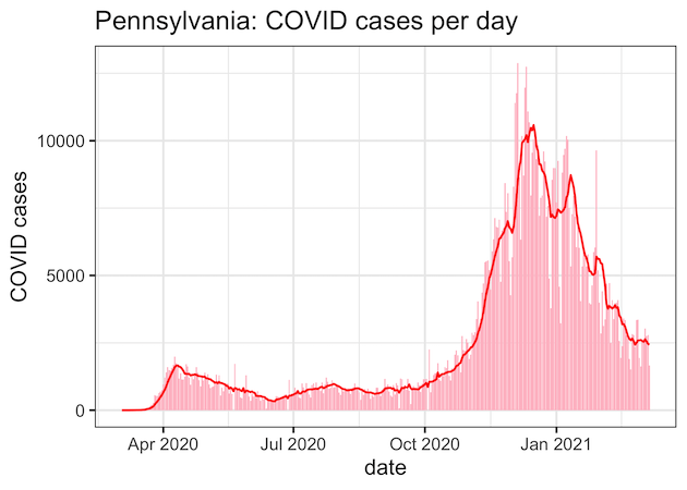
In this post we will learn how to make a time-series plot with a rolling mean using R. Often time-series data fluctuate a lot in short-term and such fluctuations can make it difficult to see the overall pattern in the plot. A solution is to smooth-out the short term fluctuations by computing rolling mean or… Continue reading How to Make Time-Series Plot with Rolling Mean in R?
How to Make Boxplot with a Line Connecting Mean Values in R?
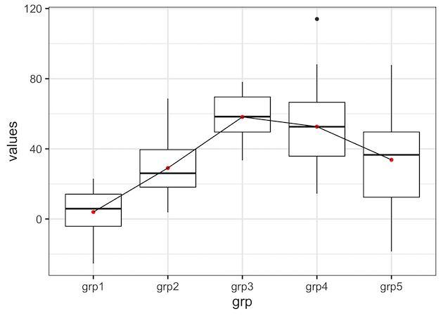
In this post, we will learn how to draw a line connecting the mean (or median) values in a boxplot in R using ggplot2. Connecting mean or median values in each group i.e. each box in boxplot can help easily see the pattern across different groups. The basic idea in making a boxplot with a… Continue reading How to Make Boxplot with a Line Connecting Mean Values in R?
How to Add Labels to Select Points with ggrepel?
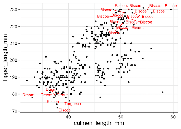
In this post, we will see how to add labels or annotations to select data points such that the labels don’t overlap with each other. We will use the R package ggrepel together with ggplot to add labels without overlaps. More specifically we will use geom_text_repel() function from ggrepel to add annotations to data points.… Continue reading How to Add Labels to Select Points with ggrepel?
How to reorder barplots with facetting with ggplot2 in R?

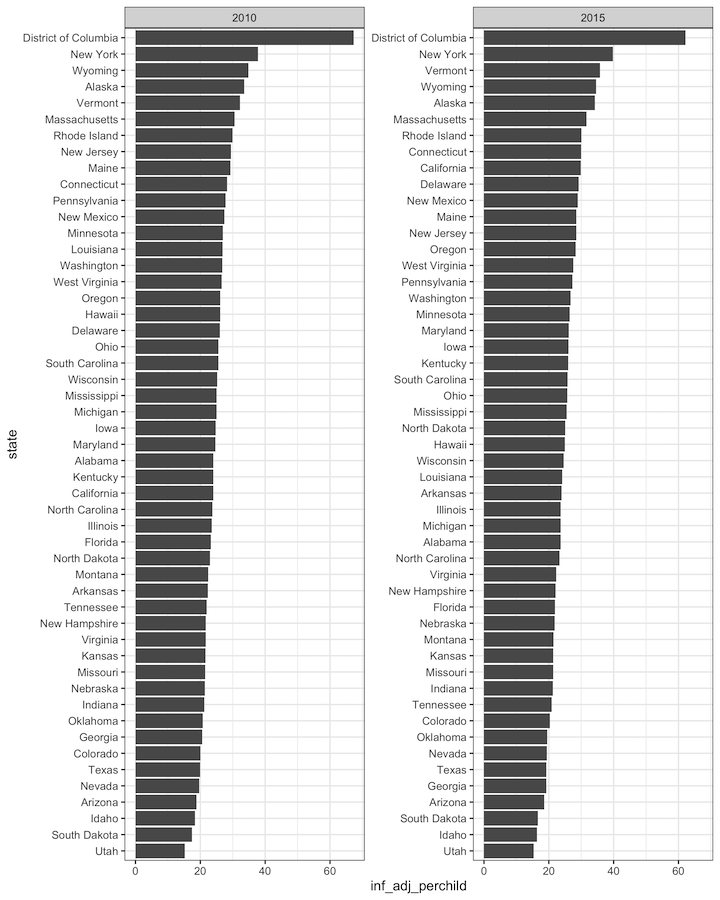
Reordering bars in barplot either in ascending or descending order can help quickly see how the groups/categories vary. When you have a thrid variable, adding facet to the barplot can be very useful. In this tutorial, we will see how to reorder bars in barplot with facetting by a thrid variable using ggplot2 in R.… Continue reading How to reorder barplots with facetting with ggplot2 in R?