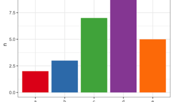
In this tutorial we will learn to how to color bars in a barplot using R Color Brewer's color palettes. R Color Brewer package "RColorBrewer" offers numerous color palettes that are useful in common situations. For example, it gives "Sequential" palette for ordered data, … [Read more...] about How to Color Barplots with R Color Brewer
R
How to Highlight Groups with Convex Hull in ggplot2
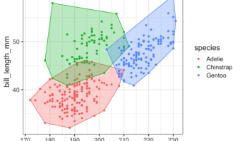
In this tutorial, we will learn how to annotate or add colors to multiple groups in a scatter plot made with ggplot2 in R using convex hull shapes. Convex hull is basically a box or polygon connecting the outermost data points for each group in a scatter plot with multiple … [Read more...] about How to Highlight Groups with Convex Hull in ggplot2
How to Make Beautiful Tables with gtExtras
A well made table showing the summary of the data is under utilized. gt() package available as part of tidyverse improves the look of a table and makes it easy to read and understand. If you think gt is cool, wait until you see the work of Thomas Mock. Thomas Mock has created … [Read more...] about How to Make Beautiful Tables with gtExtras
Side by side plots with ggplot2 using gridExtra

In this tutorial, we will learn how to place two plots made with ggplot2 side by side. In R, we have multiple solutions to combine plots into a single plot. Here, we will use R Package gridExtra's function grid.arrange to combine two plots side by side. Firs, let us load the … [Read more...] about Side by side plots with ggplot2 using gridExtra
How to Make Axis Title Bold Font with ggplot2

In this tutorial, we will learn how to change the axis title bold font with ggplot2 in R. Let us load the packages needed including tidyverse and palmerpenguins for penguins data. A plot with default font for axis title text Let us make a simple scatter plot using … [Read more...] about How to Make Axis Title Bold Font with ggplot2