
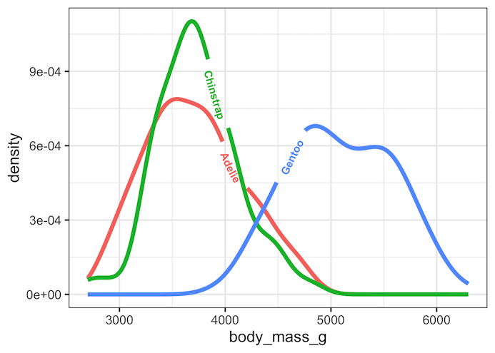
Labeling a plot greatly help understand the gist of a plot easily. ggplot2 offers a number of ways to add text labels to a plot. Often directly adding the labels on a plot instead of having a legend is a better option. The R package, geomtextpath, a ggplot2 extension package offers a nice solution and… Continue reading Direct Labeling on line plots with geomtextpath
Category: R
Remove Legend Title in ggplot2 (labs, guides, theme)

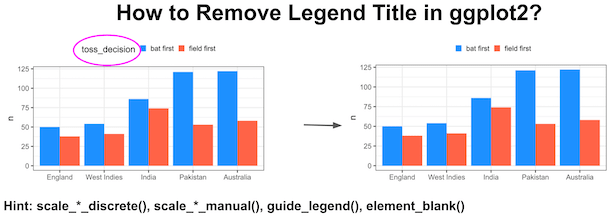
In this tutorial, you’ll learn four easy ways to remove legend titles in ggplot2 using scale_fill_discrete(), scale_fill_manual(), guides() with guide_legend(), and theme(legend.title = element_blank()). Each method works slightly differently depending on whether your legend comes from fill or color. We’ll start with a barplot example and end with a universal one-line fix that works in… Continue reading Remove Legend Title in ggplot2 (labs, guides, theme)
Visualizing Stock Return of a Company Over Time with Barplots


In this tutorial, we will learn how to visualize a company’s stock return over time. A stock’s return is defined as the capital gains/losses and income from dividend. We will use the adjusted stock price to compute the nominal return using the fantastic tidyquant R package. First, we will download the stock data of a… Continue reading Visualizing Stock Return of a Company Over Time with Barplots
Adding and Troubleshooting Text Annotations on a plot with ggplot2

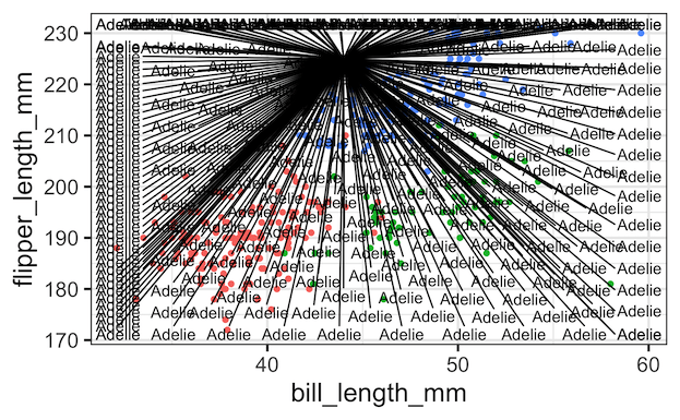
Adding text annotations to a plot can greatly help understanding a plot better. In this tutorial, we will learn couple of examples of adding text annotations to a scatter plot with three groups of samples. First we see couple of examples of what might typically go wrong while trying to add annotations with ggplot2. And… Continue reading Adding and Troubleshooting Text Annotations on a plot with ggplot2
Visualizing Stock Price of a Single Company Over Time


In this tutorial, we will learn how to visualize a company’s stock price over time. Stock data is an example of time series data, where we have stock price of a company for a period of time. First, we will learn how to get stock price for a company of interest and use ggplot2 to… Continue reading Visualizing Stock Price of a Single Company Over Time