In this tutorial, we will learn how to visualize a company’s stock price over time. Stock data is an example of time series data, where we have stock price of a company for a period of time. First, we will learn how to get stock price for a company of interest and use ggplot2 to make a simple line plot to see the price over time. Then we will see examples of customizing the time-series plot.
Let us get started by loading the packages needed. We use tidyquant R package to retrieve Stock price of a company of interest and then load tidyverse.
library(tidyquant)
library(tidyverse)
theme_set(theme_bw(16))
We will use Google’s stock price since 2019.
company_name <- "Google"
company_ticker ="GOOG"
Download Stock Data using tidyquant’s tq_get() function
tidyquant is a fantastic package to do all things related stock data analysis using tidy principles. Here we use just one of the functions, tq_get() from tidyquant to pull Google’s stock data starting from 2019.
stock_df <- tq_get(company_ticker,
                 get = "stock.prices",
                 from ="2019-1-1" ,
                 to = Sys.Date())
Dataframe containing Google’s stock data looks like this.
stock_df %>% head()

## # A tibble: 6 × 8
##   symbol date        open  high   low close  volume adjusted
##   <chr>  <date>     <dbl> <dbl> <dbl> <dbl>   <dbl>    <dbl>
## 1 GOOG   2019-01-02 1017. 1052. 1016. 1046. 1532600    1046.
## 2 GOOG   2019-01-03 1041  1057. 1014. 1016. 1841100    1016.
## 3 GOOG   2019-01-04 1033. 1071. 1027. 1071. 2093900    1071.
## 4 GOOG   2019-01-07 1072. 1074  1055. 1068. 1981900    1068.
## 5 GOOG   2019-01-08 1076. 1085. 1061. 1076. 1764900    1076.
## 6 GOOG   2019-01-09 1082. 1083. 1066. 1075. 1199300    1075.
Visualize Stock Price of a Company Over Time
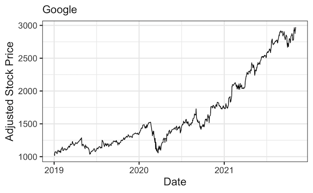
Using the data we downloaded, let us make a time series plot with date on x-axis and stock price on y-axis using ggplot2’s geom_line().
stock_df %>%
  ggplot(aes(x=date,y=adjusted))+
  geom_line()+
  labs(y="Adjusted Stock Price",
       x="Date",
       subtitle=company_name)
ggsave("plot_stock_price_over_time.png")
Note the date column in the dataframe is of Date variable and ggplot2 has made the plot showing the date on x-axis.

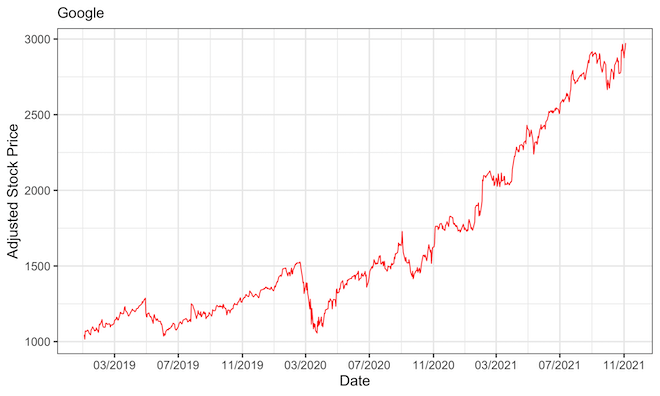
Add color to the Stock Price plot
Let us customize the stock price plot by adding color to the line.
# Add color to the line
stock_df %>%
  ggplot(aes(x=date,y=adjusted))+
  geom_line(color="red")+
  labs(y="Adjusted Stock Price",
       x="Date",
       subtitle=company_name)
ggsave("plot_stock_price_over_time_adding_color.png")

Customizing Date on x-axis with month name and year
By default, out plot simply shows the year alone on x-axis in the plot. Let us customizing the date on x-axis. We use scale_x_date() function to specify how the date values on x-axis should look like. We specify month name and year and show it for every four months.
stock_df %>%
  ggplot(aes(x=date,y=adjusted))+
  geom_line(color="red")+
  labs(y="Adjusted Stock Price",
       x="Date",
       subtitle=company_name) +
  scale_x_date(date_breaks = "4 month", date_labels = "%b %Y")
ggsave("stock_price_plot_month_name_year_date_with_scale_x_date.png", width=12, height=8)

Customizing Date on x-axis with month number and year
Here we change Date values on x-axis by showing number for months and year using scale_x_date() function.
stock_df %>%
  ggplot(aes(x=date,y=adjusted))+
  geom_line(color="red")+
  labs(y="Adjusted Stock Price",
       x="Date",
       subtitle=company_name) +
  scale_x_date(date_breaks = "4 month", date_labels = "%m/%Y")
ggsave("stock_price_plot_customize_date_with_scale_x_date.png", width=12, height=8)
Explore the Complete ggplot2 Guide
35+ tutorials with code: scatterplots, boxplots, themes, annotations, facets, and more—tested and beginner-friendly.
Visit the ggplot2 Hub → No fluff—just code and visuals.