
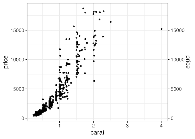
In this tutorial, we will learn how to duplicate the primary axis in a plot made with ggplot2. We can duplicate either y-axis or x-axis using ggplot2’s sec.axis() function. Here we will first see an example of duplication y axis and then an example duplicating x-axis using sec.axis method. Let us load tidyverse. How to… Continue reading How to duplicate y-axis in ggplot2
Category: ggplot2
Four geoms in ggplot2 to visualize uncertainty
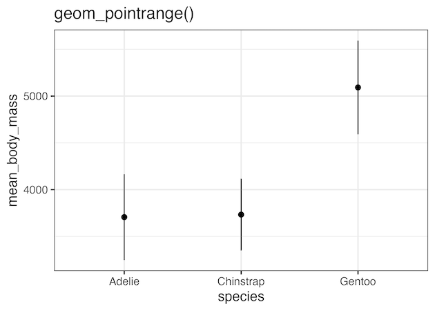
In this post, we will learn about four geoms in ggplot2 that are useful for revealing uncertainty in numerical variables with multiple categories. The four geoms, geom_errorbar(), geom_linerange(), geom_crossbar(), and geom_pointrange() are useful when we have categeorical x values and we are interested in the “distribution of y conditional on x and use the aesthetics… Continue reading Four geoms in ggplot2 to visualize uncertainty
How to make legend order match with plot

In this post we will learn how to make a line plot such that data on the plot matches with the legend order. We will use forcats package’s fct_reorder2() function. Let us load the packages needed. We will use gapminder data set to make a line plot. First let us compute average life expectancy per… Continue reading How to make legend order match with plot
How to make boxplots between one categorical variable vs all numerical variables

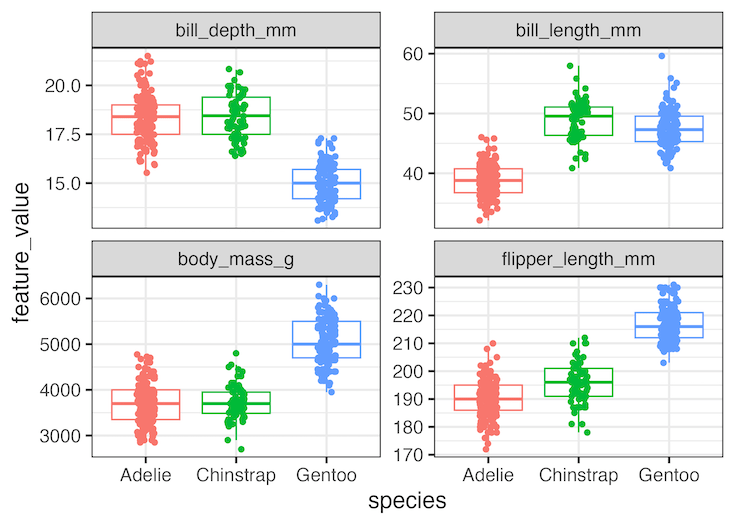
Often one might be interested in quickly visualizing the relationship between one categorical vs all numerical variables in a dataframe. We can make multiple boxplots between one categorical variable against all the numerical variables on the dataframe at the same time. In this post we will consider a simple example where our dataframe contains one… Continue reading How to make boxplots between one categorical variable vs all numerical variables
How to Change ggplot theme with ggthemes

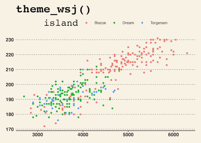
In this post, we will learn how to make beautiful plots with ggplot2 using themes from ggthemes R package. By default ggplot2 makes plots with grey background, using theme_grey(). ggplot2 comes with about 8 complete themes that help us change the look of a given plot. If you want to customize your plot with more… Continue reading How to Change ggplot theme with ggthemes