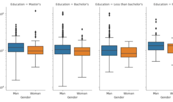
Facet plots, where one subsets the data based on a categorical variable and makes a series of similar plots with same scale is a great way to visualize when you have a numerical variable and a corresponding categorical variable. It is also known as small multiples as we make a … [Read more...] about How To Make Simple Facet Plots with Seaborn Catplot in Python?
Python
How To Make Density Plot in Python with Altair?

Density plots are like histogram, but displays density instead of counts. In this post, we will see a simple example of making a density plot in Python using Altair. Let us load Pandas and Altair to make density plot. We will use the tuition dataset from TidyTuesday … [Read more...] about How To Make Density Plot in Python with Altair?
How to Make Countplot or barplot with Seaborn Catplot?

Sometimes you might want to make countplot or barplots in Python, but the data may not in the right format. For example, you might want to make countplot/barplot of the number of things corresponding to multiple categorical variables. However, the data may in the form such that … [Read more...] about How to Make Countplot or barplot with Seaborn Catplot?
How To Highlight a Time Range in Time Series Plot in Python with Matplotlib?
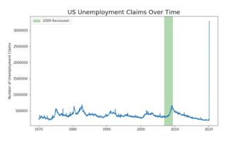
Time Series Plots are line plots with x-axis being date time instead of regular quantitative or ordered categorical variable. Sometimes you might want to highlight a region on a time series plot. In this post, we will learn how to highlight a time interval with a rectangular … [Read more...] about How To Highlight a Time Range in Time Series Plot in Python with Matplotlib?
How to Make Overlapping Histograms in Python with Altair?
In this post, we will learn how to make multiple overlapping histograms in Python using Altair. Using Altair, we can make overlapping histograms or layers histograms from data that is in wide form and long tidy form. We will see an example of making overlapping histograms … [Read more...] about How to Make Overlapping Histograms in Python with Altair?