
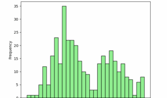
If you've ever stared at a column of numbers in a dataset and struggled to understand its underlying story, you're not alone. Raw data tells us little about the bigger picture. This is where the histogram shines. It's more than just a bar chart; it's your fastest tool for … [Read more...] about Histograms with Seaborn in Python
Python
How To Make Histograms with Matplotlib in Python?
If you've ever stared at a column of numbers in a dataset and struggled to understand its underlying story, you're not alone. While many libraries can create plots quickly, true mastery of Python visualization comes from understanding Matplotlib—the foundational engine that gives … [Read more...] about How To Make Histograms with Matplotlib in Python?
How To Add Dollar Sign on Axis Ticks in Matplotlib

In this tutorial, we will see examples of how to add dollar sign on axis ticks while making plots with Matplotlib in Python. While making plots to understand the relationship between currency like US dollars and other variables, it is better to show the Dollar symbol/sign on the … [Read more...] about How To Add Dollar Sign on Axis Ticks in Matplotlib
How To Annotate Barplot with bar_label() in Matplotlib

Annotating barplots with labels like texts or numerical values can be helpful to make the plot look better. Till now, one of the options add annotations in Matplotlib is to use pyplot's annotate() function. Starting from Matplotlib version 3.4.2 and above, we have a new … [Read more...] about How To Annotate Barplot with bar_label() in Matplotlib
Connect Paired Data Points in a Scatter Plot in Python (Step-by-Step Guide)
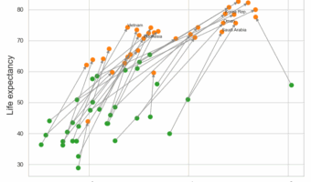
Want to connect paired data points in a scatter plot using Matplotlib? This step-by-step tutorial shows you how to draw lines between paired observations so you can easily visualize before–after comparisons, longitudinal changes, and repeated-measures data. We cover four … [Read more...] about Connect Paired Data Points in a Scatter Plot in Python (Step-by-Step Guide)