In this post, we will see examples of removing some of the legends from a plot having multiple legends made with ggplot2. Legends in a plot help us understand the relationship between two variables in a plot with respect to other variables in the dataset.
We will learn that we can remove all legends in a plot using theme(legend.position=”none”). We will show how to use guides() function to remove legends selectively. We can selectively
- remove legend from color using guides(color=”none”),
- remove legend from fill argument using guides(fill=”none”),
- remove legend from shape using guides(shape=”none”),
- remove legend from size using guides(size=”none”).
Let us get started by loading the packages needed.
library(palmerpenguins)
theme_set(theme_bw(18))
library(tidyverse)
We will use random sample of Palmer Penguin dataset to make a plot with multiple legend groups.
# <a href="https://cmdlinetips.com/2022/07/randomly-select-rows-from-dataframe-dplyr/">randomly sample rows using sample_n()</a>
df <-  penguins %>%
  drop_na() %>%
  sample_n(50)
Our data for showing how to selectively remove legend looks like this.
df %>%
  head()

# A tibble: 6 × 8
  species island bill_length_mm bill_depth_mm flipper_length_… body_mass_g sex
  <fct>   <fct>           <dbl>         <dbl>            <int>       <int> <fct>
1 Gentoo  Biscoe           49.1          14.8              220        5150 fema…
2 Chinst… Dream            46.4          17.8              191        3700 fema…
3 Adelie  Dream            38.1          18.6              190        3700 fema…
4 Adelie  Biscoe           38.1          17                181        3175 fema…
5 Gentoo  Biscoe           45.4          14.6              211        4800 fema…
6 Chinst… Dream            51.3          19.9              198        3700 male
# … with 1 more variable: year <int>
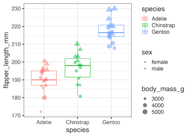
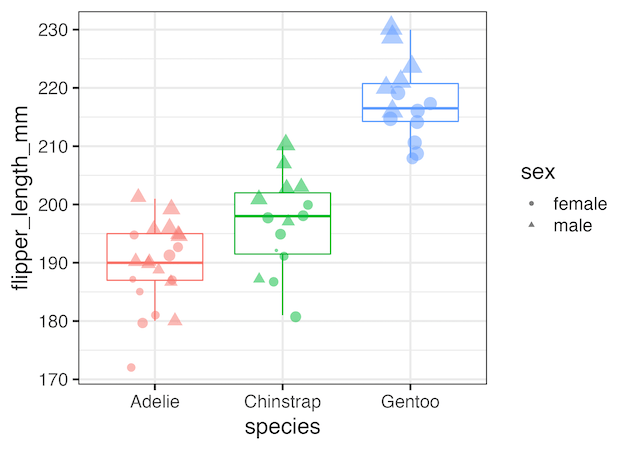
First, let us make a boxplot with multiple legends. In this example, we make a boxplot between species and flipper length of penguins. We use color legend to highlight the species variable, shape legend for showing sex and size for body mass.
df %>%
  ggplot(aes(x=species,
             y=flipper_length_mm,
             color=species))+
  geom_boxplot(outlier.shape=NA)+
  geom_jitter(width=0.1, alpha=0.5,aes(shape=sex, size=body_mass_g))
ggsave("boxplot_with_multiple_legends.png")
Remove all legends using theeme(legend.position=”none”)
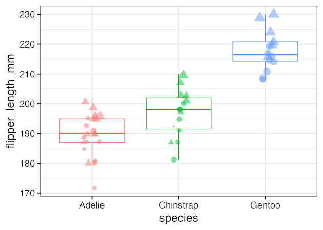
Using theme(legend.position=”none”) as additional layer to our ggplot2 code we can remove all the legends at once.
df %>%
  ggplot(aes(x=species,
             y=flipper_length_mm,
             color=species))+
  geom_boxplot(outlier.shape=NA)+
  geom_jitter(width=0.1, alpha=0.5,aes(shape=sex, size=body_mass_g))+
  theme(legend.position="none")
ggsave("remove_all_legends_with_theme.png")
Selectively remove legend created by color
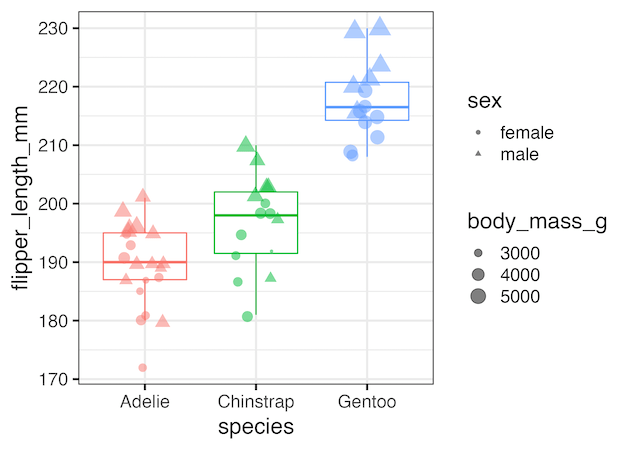
Using guides(color=”none”) as additional layer to our ggplot2 code we can remove. legend created by color argument within aes().
#. Selectively Remove a legend: Example 1
df %>%
  ggplot(aes(x=species,
             y=flipper_length_mm,
             color=species))+
  geom_boxplot(outlier.shape=NA)+
  geom_jitter(width=0.2, alpha=0.5,aes(shape=sex, size=body_mass_g))+
  guides(color="none")
ggsave("selectively_remove_a_legend_with_guides.png")
Selectively remove legend created by shape argument
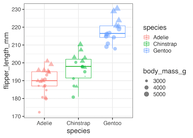
Similarly, we can use guides(shape=”none”) as additional layer to our ggplot2 code we can remove legend created by shape argument.
df %>%
  ggplot(aes(x=species,
             y=flipper_length_mm,
             color=species))+
  geom_boxplot(outlier.shape=NA)+
  geom_jitter(width=0.2, alpha=0.5,aes(shape=sex, size=body_mass_g))+
  guides(shape="none")
ggsave("selectively_remove_a_legend_with_guides_example2.png")
Selectively remove multiple legends
We can also use guides() function to selectively remove multiple legends, but not all, by specifying the arguments that created the legends. For example, in the example below we remove the legends created by size and color arguments using guides(size=”none”, color=”none”).
df %>%
  ggplot(aes(x=species,
             y=flipper_length_mm,
             color=species))+
  geom_boxplot(outlier.shape=NA)+
  geom_jitter(width=0.2, alpha=0.5,aes(shape=sex, size=body_mass_g))+
  guides(size="none", color="none")
ggsave("selectively_remove_two_legends_with_guides.png")


Hi there.
I have a question regarding the post “How to Connect Data Points on Boxplot with Lines?”, June 8, 2020. This post had no room for comments.
By creating the pipeline for the dataframe with the “paired” column, my rows were paired randomly, instead to the values of the column I chose.
I simply switched the variable names to mine, ID number = country, and my own x and y, respectively, year and lifeExp.
What can I do to pair my rows according to the ID number?
Thank you in advance,
Joel Laia
May be I have not fully understood the question. I think you can use groupby on ID and create group numbers using one of the context dependent expression for creating paired data https://dplyr.tidyverse.org/reference/context.html