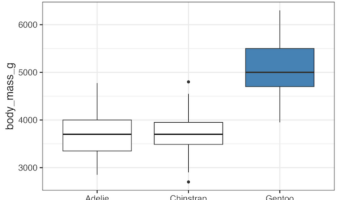
In this tutorial, we will learn how to highlight a select boxplot using ggplot2 in R. By highlighting a select boxplot with specific color, we can easily divert the attention to it. Let us first load the packages needed. We will use Palmer Penguins dataset to make … [Read more...] about How to Highlight Select boxplot in ggplot2
Visualizing Stock Price of Multiple Companies Over Time
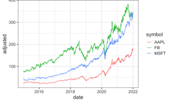
In this tutorial, we will learn how to visualize stock prices of multiple companies over time. Stock data is a great example of time series data, where we have stock price of a company for a period of time. First, we will show how to get stock price for multiple companies of … [Read more...] about Visualizing Stock Price of Multiple Companies Over Time
How to arrange months in right order with ggplot2
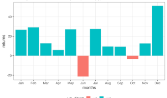
In this tutorial, we will learn how to arrange months in right order - chronologiocal order. By default, when we make a plot with months on one of the axis using ggplot2, we might get a plot with months ordered in alphabetical order, depending on how the month variable is stored … [Read more...] about How to arrange months in right order with ggplot2
How to make axis tick label bold

In this post, we learn how to make axis tick labels bold in ggplot2 R. If you wonder what are axis tick labels, they are the text labels that appear right below the tick marks on a graph's x and y axes. These labels play an omportant role in helping interpret the values … [Read more...] about How to make axis tick label bold
How to make Donut plot with ggplot2

In this tutorial, we will learn how to make a donut plot in R using ggplot2. Donut plot is nothing but a bar plot, reshaped into pie-chart, and then adding a hole at the center to make it look like a donut. We will learn these in step by step manner to understand making Donut … [Read more...] about How to make Donut plot with ggplot2