• Skip to primary navigation
  • Skip to main content
  • Skip to primary sidebar

Data Viz with Python and R

Learn to Make Plots in Python and R

  • Home
  • Seaborn
  • Matplotlib
  • ggplot2
  • Altair
  • About
    • Privacy Policy
  • Visualizing Activation Functions in Neural Networks
  • Confusion Matrix Calculator
  • Visualizing Dropout Rate in Neural Network
  • Visualizing Loss Functions in Neural Networks
  • Show Search
Hide Search

How to Make Grouped/Stacked Barplot in R?

datavizpyr · February 25, 2021 ·

Grouped Barplot with position="dodge"

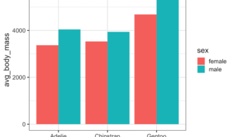
When you have dataset with two categorical variables and one quantitative variable, a grouped barplot is a great way to see the relationship among the variable. In a simple barplot, we have categorical variable on x-axis and have bars showing the numerical value of the … [Read more...] about How to Make Grouped/Stacked Barplot in R?

Filed Under: ggplot2, R Tagged With: barplot with bars side by side, Grouped Barplot R

Grouped Boxplot with Jittered Points with Seaborn Python

datavizpyr · February 21, 2021 ·

Grouped Boxplot with Jittered Data Points Seaborn

Grouped boxplots help us visualize the relationship between three variables, two categorical variables and one quantitative variable. When we make a boxplot, it is always a good idea to add the original data points on top of the boxplot, when possible. In this post, we will learn … [Read more...] about Grouped Boxplot with Jittered Points with Seaborn Python

Filed Under: Grouped Boxplot with points, Python, Seaborn, Seaborn Boxplot Tagged With: boxplot python, Python, Seaborn, Seaborn Boxplot

How to Change X and Y Axis Values from Real to Integers in ggplot2

datavizpyr · February 13, 2021 ·

How to Change X or Y-axis Values to Integers?

When you make a plot with ggplot2, it automatically chooses appropriate range for x and y-axis values and it can be either floats or integers. In this post, we will see how to change X/Y-axis values to integers. In ggplot2, we can use scale_x_continuous() and scale_y_continuous() … [Read more...] about How to Change X and Y Axis Values from Real to Integers in ggplot2

Filed Under: ggplot2, integers on x-axis ggplot2, R Tagged With: ggplot2, R

How to Make Grouped Boxplot with Jittered Data Points in ggplot2

datavizpyr · February 5, 2021 ·

Grouped Boxplot with jittered points using position_jitterdodge()

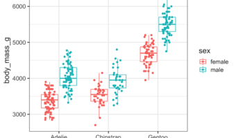
Grouped boxplots are excellent for comparing distributions across multiple categories, but they can hide important details about sample sizes and individual data points. By adding jittered points to your ggplot2 boxplot with points, you create more informative visualizations that … [Read more...] about How to Make Grouped Boxplot with Jittered Data Points in ggplot2

Filed Under: ggplot2, grouped boxplot, grouped boxplot with jittered data, R Tagged With: ggplot2 position_jitterdodge(), grouped boxplot with jittered data

How To Change Edge Color on Seaborn Scatter Plot?

datavizpyr · January 31, 2021 ·

Seaborn Scatterplot: Change edgecolor and line width

Seaborn's scatterplot function allows us to make compelling scatter plots easily. In this post we will learn how to customize edge color of a scatter plot made with Seaborn. By default, Seaborn's scatter plot function colors the markers edge color to be white. In this post, … [Read more...] about How To Change Edge Color on Seaborn Scatter Plot?

Filed Under: Python, Scatterplot change edgecolor, Seaborn, Seaborn Scatterplot Tagged With: Python, Seaborn

  • « Go to Previous Page
  • Page 1
  • Interim pages omitted …
  • Page 23
  • Page 24
  • Page 25
  • Page 26
  • Page 27
  • Interim pages omitted …
  • Page 55
  • Go to Next Page »

Primary Sidebar

Python & R Viz Hubs

  • Seaborn Guide & Cookbook
  • ggplot2 Guide & Cookbook
  • Matplotlib Guide & Cookbook
  • Confusion Matrix Calculator
  • Visualizing Activation Functions
  • Visualizing Dropout
  • Visualizing Loss Functions

Buy Me a Coffee

Copyright © 2026 · Daily Dish Pro on Genesis Framework · WordPress · Log in

Go to mobile version