
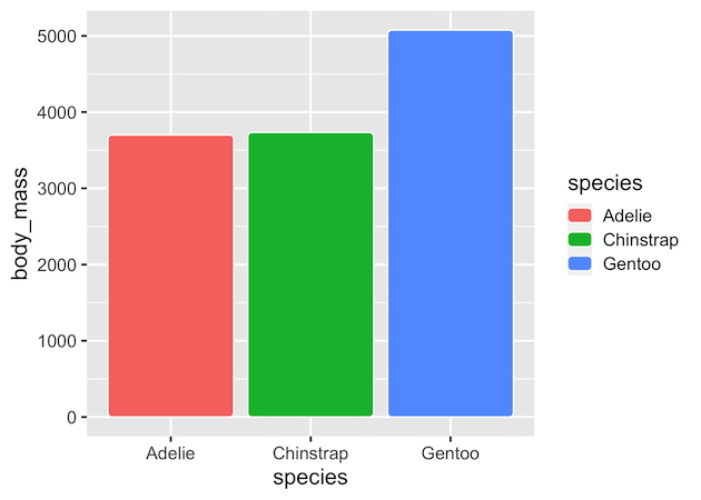
In this tutorial, we will learn how make bar plots with rounded edges in ggplot. We will use ggplot2 extension package called ggchicklet developed by the fantastic R developer boB Rudis/hrbrmstr. Let us get started by installing ggchicklet and loading tidyverse. We have installed ggchicklet version 0.5.2. Let us quickly generate data for making a… Continue reading How to Make Barplots with rounded edges in ggplot
Visualizing Binomial Distribution in R
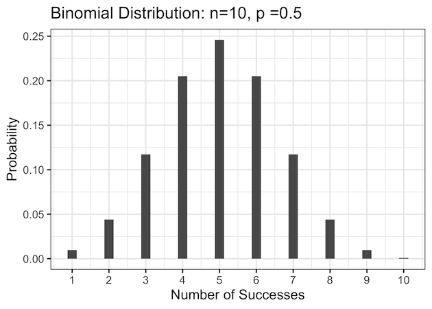
Introduction: Understanding and Visualizing the Binomial Distribution in R The binomial distribution is one of the most common discrete probability distributions in statistics. It models the number of successes in n independent Bernoulli trials, each with the same probability of success p. The classic example of binomial distribution is tossing a coin n times and… Continue reading Visualizing Binomial Distribution in R
How to add water mark on a ggplot
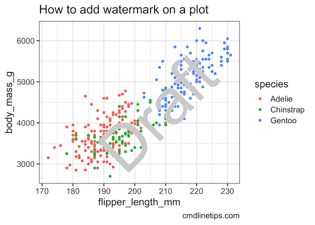
In this tutorial, we will learn how to add water marks to a plot made in R. We will use ggplot2 to make the plot and use the R package cowplot to add water mark on top the plot. The cowplot package developed by Claus Wilke functions to draw with and on plots. These functions… Continue reading How to add water mark on a ggplot
How to Reverse and Reorder Facets in ggplot2 (R) with fct_rev, factor, and fct_relevel

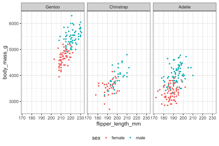
By default, ggplot2 arranges facets in alphabetical order based on the factor levels of the variable you facet by. This behavior is logical but not always useful. Analysts often need to reverse or customize facet order to match reporting requirements, presentation style, or domain conventions. For example, showing “Graduate, Undergraduate, High School” rather than the… Continue reading How to Reverse and Reorder Facets in ggplot2 (R) with fct_rev, factor, and fct_relevel
How to Add Colors to Axis Tick Label in ggplot2


In this tutorial, we will learn how to add colors to axis tick labels in ggplot2. To add colors to axis labels we will use the R package “ggtext: Improved text rendering support for ggplot2” developed by Claus Wilke. Let us get started by loading the packages needed. We will use Palmer Penguin data set… Continue reading How to Add Colors to Axis Tick Label in ggplot2