Sometimes you might want to make countplot or barplots in Python, but the data may not in the right format. For example, you might want to make countplot/barplot of the number of things corresponding to multiple categorical variables. However, the data may in the form such that you have compute the counts per category. Seaborn’s Catplot can make that computation under the hood and make the countplot/barplot for you.
In this post, we will see an example of how to make a countplot/barplot with Seaborn Catplot making the necessary computation needed. Let us load the packages.
import seaborn as sns
import matplotlib.pyplot as plt
import pandas as pd
We will use the Stack Overflow 2019 Survey results to make countplot or barplot.
data_url="https://bit.ly/3aYBbhQ"
#data_url ="https://raw.githubusercontent.com/datavizpyr/data/master/SO_data_2019/StackOverflow_survey_filtered_subsampled_2019.csv"
data = pd.read_csv(data_url)
The survey results data contains salary, education and gender information with coding experience.
print(data.head(3))
  CompTotal Gender Manager YearsCode Age1stCode YearsCodePro   Education
0   180000.0    Man      IC        25         17           20    Master's
1    55000.0    Man      IC         5         18            3  Bachelor's
2    77000.0    Man      IC         6         19            2  Bachelor's
To make countplot/barplot with Seaborn’s Catplot, we will focus only on education and gender . So let us subset these two variables from the survey data.
df = data[['Education','Gender']]
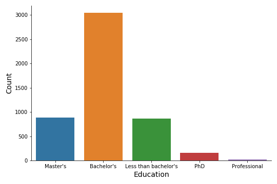
Barplot or Countplot with Seaborn Catplot
Let us say we want to make a countplot/barplot of the counts of different types of educational qualifications. Here our aim is to have the education on x-axis and the count – number of developers with the education as bars. One option is to compute the count per educational groups and create a smaller dataframe and then make the barplot.
With Seaborn’s Catplot, we can let Seaborn count under the hood and make the barplot/countplot. We can use catplot with arguments cofor x-axis and kind=”count”.
sns.catplot( x='Education',
             kind="count",
             data=df,
             height=5,
             aspect=1.5)
plt.xlabel("Education", size=14)
plt.ylabel("Count", size=14)
plt.tight_layout()
plt.savefig("Countplot_or_barplot_with_Seaborn_catplot.png")
And we will get a nice barplot or countplot with education on x-axis and a bar for the number of developers with specific education.

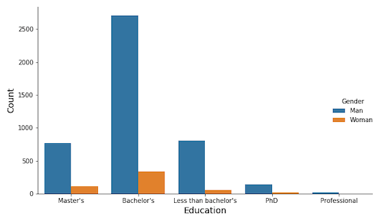
Grouped Barplot or Countplot with Seaborn Catplot
We can also make grouped countplot or barplot using Seaborn’s Catplot, in a similar manner. In addition to x-axis variable and kind=”count”, we can use hue argument with another variable. In this case, we provide hue=”Gender” and Seaborn’s catplot can make grouped counts and make the grouped barplot.
sns.catplot( x='Education',
             kind="count",
             hue="Gender",
             height=5,
             aspect=1.5,
             data=df)
plt.xlabel("Education", size=14)
plt.ylabel("Count", size=14)
plt.tight_layout()
plt.savefig("Grouped_barplot_with_Seaborn_catplot.png")