• Skip to primary navigation
  • Skip to main content
  • Skip to primary sidebar

Data Viz with Python and R

Learn to Make Plots in Python and R

  • Home
  • Python Viz
  • Seaborn
  • Altair
  • R Viz
  • ggplot2
  • About
    • Privacy Policy
  • Show Search
Hide Search

R

Coloring Barplots with ggplot2 in R

datavizpyr · January 6, 2020 ·

Coloring Barplots by a Variable with ggplot2

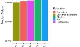
In this tutorial, we will see examples of making barplots and coloring the barplots in a few simple ways. We will see how to color barplots manually by specifying a color of interest and how to color a barplot by another variable in the dataset. Let us load tidyverse suite of … [Read more...] about Coloring Barplots with ggplot2 in R

Filed Under: barplot ggplot2, color barplots in R, R Tagged With: barplot, ggplot2, R

How to Make Horizontal Stacked Barplots with ggplot2 in R?

datavizpyr · January 2, 2020 ·

Stacked Barplots Side By Side with ggplot2 in R

Stacked barcharts are a variant of barplots, when you have data from multiple groups. In this tutorial, we will see two examples of making stacked barplots using ggplt2 in R. First we will see how to make stacked barplot of two groups with one on top of the other. In the second … [Read more...] about How to Make Horizontal Stacked Barplots with ggplot2 in R?

Filed Under: barplot ggplot2, R, stacked barplot, stacked barplot side by side Tagged With: barplot, ggplot2, R

Heatmap from Matrix using ggplot2 in R

datavizpyr · January 1, 2020 ·

Heatmap from Matrix with ggplot2

Heatmaps are data visualization tool that displays a matrix of data as a matrix of colors. For example, matrix elements with low values will have lighter colors and the elelments with high values will have a darker color. In earlier post we saw examples of making heatmap … [Read more...] about Heatmap from Matrix using ggplot2 in R

Filed Under: Heatmaps in R, Heatmaps with ggplot2, R Tagged With: ggplot2, heatmap, R

How To Make Simple Heatmaps with ggplot2 in R?

datavizpyr · December 28, 2019 ·

How to Make Heatmap with ggplot2?

Heatmaps visualizes multi-dimensional data as a matrix filled with colors based on their numerical value. For example the portion of matrix with low values will have one color and the portion with high values will have another color. This can help us identify the pattern in the … [Read more...] about How To Make Simple Heatmaps with ggplot2 in R?

Filed Under: Heatmaps in R, Heatmaps with ggplot2, R Tagged With: ggplot2, R

How To Make Boxplots with Data Points in R using ggplot2?

datavizpyr · December 27, 2019 ·

Adjusting width: Boxplot with points using geom_jitter() with jitter

Boxplots with data points are a great way to visualize multiple distributions at the same time without losing any information about the data. In this tutorial, we will see examples of making Boxplots with data points using ggplot2 in R and customize the boxplots with data … [Read more...] about How To Make Boxplots with Data Points in R using ggplot2?

Filed Under: Boxplot ggplot2, R Tagged With: ggplot2, R

  • « Go to Previous Page
  • Page 1
  • Interim pages omitted …
  • Page 32
  • Page 33
  • Page 34
  • Page 35
  • Page 36
  • Go to Next Page »

Primary Sidebar

Tags

Altair barplot Boxplot boxplot python boxplot with jiitered text labels Bubble Plot Color Palette Countplot Density Plot Facet Plot gganimate ggplot2 ggplot2 Boxplot ggplot2 error ggplot boxplot ggridges ggtext element_markdown() Grouped Barplot R heatmap heatmaps Histogram Histograms Horizontal boxplot Python lollipop plot Maps Matplotlib Pandas patchwork pheatmap Pyhon Python R RColorBrewer reorder boxplot ggplot Ridgeline plot Scatter Plot Scatter Plot Altair Seaborn Seaborn Boxplot Stock Price Over Time Stripplot UpSetR Violinplot Violin Plot World Map ggplot2

Buy Me a Coffee

Copyright © 2025 · Daily Dish Pro on Genesis Framework · WordPress · Log in

Go to mobile version